Showing posts with label Substitution effect. Show all posts

Saturday, 14 March 2026

Artificial intelligence and the 'age of leisure'

My ECONS101 class covered constrained optimisation last week, and one of the models we looked at was the labour-leisure trade-off for workers. Now artificial intelligence, and in particular generative AI, is likely to have large impacts on the labour-leisure trade-off. As the Financial Times reported last year (paywalled):

The idea that technological progress can enable people to work fewer hours is not outlandish...

But in order to believe a similar trend is going to take hold again, you have to assume three things. First: that AI will deliver a substantial boost to economic productivity...

Second, you have to assume the economic gains will be widely distributed...

Third, you have to believe workers will “cash in” those proceeds in the form of extra leisure, rather than higher income. But will they? In many developed countries, there has been a slowdown in the reduction in working hours in recent decades...

Far from trading income for leisure, it is the people with the highest salaries who tend to work the longest hours.

Will workers trade off higher productivity for more leisure time? Are we about to enter an 'age of leisure'? The constrained optimisation model for the worker (see also this post) can help us clarify the possibilities. In this model, we'll assume that AI increases productivity, and that the increase in productivity is represented by higher wages for workers. [*] The model will then tell us whether workers might respond by consuming more, or less, leisure.

Our model of the worker's decision is outlined in the diagram below. The worker's decision is constrained by the amount of discretionary time available to them. Let's call this their time endowment, E. If they spent every hour of discretionary time on leisure, they would have E hours of leisure, but zero income. That is one end point of the worker's budget constraint, on the x-axis. The x-axis measures leisure time from left to right, but that means that it also measures work time (from right to left, because each one hour less leisure means one hour more of work). The difference between E and the number of leisure hours is the number of work hours. Next, if the worker spent every hour working, they would have zero leisure, but would have an income equal to W0*E (the wage, W0, multiplied by the whole time endowment, E). That is the other end point of the worker's budget constraint, on the y-axis. The worker's budget constraint joins up those two points, and has a slope that is equal to the wage (more correctly, it is equal to -W0, and it is negative because the budget constraint is downward sloping). The slope of the budget constraint represents the opportunity cost of leisure. Every hour the worker spends on leisure, they give up the wage of W0. Now, we represent the worker's preferences over leisure and consumption by indifference curves. The worker is trying to maximise their utility, which means that they are trying to get to the highest possible indifference curve that they can, while remaining within their budget constraint. The highest indifference curve they can reach on our diagram is I0. The worker's optimum is the bundle of leisure and consumption where their highest indifference curve meets the budget constraint. This is the bundle A, which contains leisure of L0 (and work hours equal to [E-L0]), and consumption of C0.

Now, let's say that the situation shown above is the situation before the advent of AI. After AI is introduced, productivity increases, and so wages increase (from W0 to W1). This causes the budget constraint to pivot outwards and become steeper (since the slope of the budget constraint is equal to the wage, the slope has increased from -W0 to -W1). The worker can now reach a higher indifference curve, and it is the position of that higher indifference curve that determines the worker's response in terms of whether they consume more leisure or not. If they move to the higher indifference curve I1, then the worker's new optimum is the bundle of leisure and consumption B, which contains leisure of L1 (and work hours equal to [E-L1]), and consumption of C1. For this worker (whose response is shown in red on the diagram), leisure hours decrease as a result of the higher wage. On the other hand, if they move to the higher indifference curve I2, then the worker's new optimum is the bundle of leisure and consumption C, which contains leisure of L2 (and work hours equal to [E-L2]), and consumption of C2. For this worker (whose response is shown in blue on the diagram), leisure hours increase as a result of the higher wage. [**]

Either of these possibilities could happen. In fact, both could happen, with some workers increasing leisure time and others decreasing leisure time. By itself, this model doesn't answer the question of what will happen, but shows that both increased leisure and decreased leisure are possible outcomes.

The key difference here comes down to the size of the income effect of the increase in wages. When wages increase, the opportunity cost of leisure increases. That makes leisure relatively more expensive, and workers should respond by consuming less leisure. That is what we call the substitution effect - workers substitute away from leisure as it becomes more expensive. However, increased wages also lead to an income effect. Leisure is a normal good, which means that as the worker's income increases, they would like to consume more leisure. Notice that the substitution effect and the income effect are working in opposite directions here. For workers who overall decrease their leisure, the substitution effect (which says they should consume less leisure) must be bigger than the income effect (which says they should consume more leisure). For workers who overall increase their leisure, the reverse is true - the substitution effect must be smaller than the income effect.

AI may lead us into an age of leisure. But only if productivity gains lead to higher wages, and the income effect of higher wages more than offsets the substitution effect.

*****

[*] The assumption that productivity gains will lead to higher wages is a strong assumption. Indeed, the FT article questions whether this assumption is valid. If productivity gains don't lead to higher wages, then this model doesn't help us evaluate whether we're about to move into an 'age of leisure', and the impacts might be more macroeconomic than microeconomic. That is, we may end up with leisure, but arising through weaker labour demand, reduced hours, or unemployment rather than through workers voluntarily choosing more leisure as wages increase.

[**] Notice that the indifference curves I1 and I2 are crossing, and indifference curves cannot cross. However, those two indifference curves are for different workers, so there is no problem. I could easily have drawn two different diagrams, one for each worker, but I've kept them both on the same diagram for efficiency.

Wednesday, 9 August 2023

The income and substitution effects of a tax cut

Benjamin Franklin once famously wrote that "in this world nothing can be said to be certain, except death and taxes". Taxes may be certain, but the tax rate is not. Tax rates vary widely across the world, and have varied widely over time for each country. Economists are concerned about tax rates because, among other things, they affect the incentives to work.

However, it isn't just any tax rate that affects work incentives. We need to take into account all of the changes that affect a worker's income, as a result of working more. Working more results in more income tax payable, but might also reduce a worker's entitlement to government transfers (social security benefits, student allowances), or reduce their entitlement to subsidies (for example, subsidised housing or healthcare) or rebates (for example childcare rebates). All of those changes need to be taken into account.

The effective marginal tax rate (EMTR) is the amount of the next dollar of earnings that a person loses to taxes, to decreases in entitlements to government transfers, and to decreases in subsidies and rebates. It is the EMTR that best captures the incentive effects of the tax and transfer system. When a worker faces a high EMTR, there is a disincentive to work more. When the EMTR is lower, there is more incentive to work.

To see why, consider what happens if the EMTR decreases. For example, if the government offers an income tax cut, this will decrease the EMTR. The after-tax-and-transfers reward for working increases, making work more attractive. The opportunity cost of leisure time (measured as the after-tax-and-transfers wage) increases, making leisure time less attractive. The worker decides to work more. This is an example of the substitution effect. The relative price of working compared with leisure has increased, encouraging a shift to more work and less leisure.

However, there is also an income effect. The higher wage increases the worker's income, and they use that income to consume more normal goods. Leisure time is a normal good, so the worker wants to consume more of it (and work less). Notice that the income effect works in the opposite direction to the substitution effect here. They offset each other.

This leads to an interesting implication of a tax cut. For some workers, especially those on low wages, the substitution effect (work more) is larger than the income effect (work less). In general, a tax cut encourages those on low wages to work more. However, for other workers, especially those on high wages, the substitution effect (work more) is smaller than the income effect (work less). In general, a tax cut encourages those on high wages to work less. Why might the high wage workers work less? Those workers may realise that they can continue to earn the same amount as before, while working fewer hours. This allows them to continue to spend the same amount as before, and have more leisure at the same time. In fact, some workers may be able to both earn and spend more, and have more leisure time.

The income and substitution effects of a tax cut do not necessarily lead all workers to work more. Some workers will respond by working less. In fact, if we look at work and leisure time over the long run (as in this post), we see workers both earning more income, and spending more time on leisure (and working fewer hours). Changes in tax rates change the incentive to work, but they don't necessarily affect all workers in the same way.

Read more:

Sunday, 23 October 2022

Work disincentives, and the income and substitution effects in social security

In yesterday's post, I discussed effective marginal tax rates and the marriage penalty in the US social security system. The social security system can create incentives (and disincentives) for activities unrelated to working and income (in that case, marriage). However, most of the time when we talk about incentive effects in social security, we are talking about decreased work incentives.

I was reminded (by a note I left myself) that Abhijit Banerjee and Esther Duflo discussed these effects in their book Good Economics for Hard Times (which I reviewed here). In particular, Banerjee and Duflo note that there are both income effects and substitution effects associated with the social security system. Specifically:

...for people near the point between being takers from and payers into the system, there is potentially a strong disincentive to work. In other words, in addition to the income effect (I do not need to work if I have enough money to survive on already) that most policy makers worry about, such schemes can have a substitution effect (working is less valuable since what I make in extra income is taken out as reduced welfare payments).

The latter point relates to the effective marginal tax rate (the amount of the next dollar of income a taxpayer earns that would be lost to taxation, decreases in rebates or subsidies, and decreases in government transfers (such as benefits, allowances, pensions, etc.) or other entitlements). To see how these disincentives work, consider the diagram below. The income curve shows the distribution of income without any transfers. The poverty line (representing the minimum level of income necessary in order to lead a comfortable life) is M*. Now consider a perfectly targeted transfer, that would raise the income of any person whose initial income is below M*, exactly up to M*. People with initial income of M* or higher receive no transfer at all.

With this perfectly targeted transfer, poverty would be eliminated. However, what we are interested in is the incentive effects. Consider a person with income of M0. They initially have zero income (probably they are not working at all), and their income is raised to M*. They do very well from the transfer. Now consider a person with income of M1. Their transfer is less, and their income is raised to M*. However, they were working (perhaps part-time) and earning M1. Comparing themselves to the person with income of M0, the person with income of M1 might realise they don't need to work so hard and can still end up with an income of M* after the transfer. This provides a disincentive to work. This is the income effect described by Banerjee and Duflo. The person with an income of M1 couldn't be incentivised to work a bit more either. Every dollar of income above M1 is eliminated by a reduction in the perfectly targeted transfer (the effective marginal tax rate is equal to 100 percent). This is the substitution effect that Banerjee and Duflo described. Now consider a person with income of M2. They are earning more than M*, but they might also look favourably at the person with income of M0, and decide to leave work. The disincentive effects don't just apply to those below the poverty line, who are initially eligible for the transfer.

Finally, Banerjee and Duflo probably understated how wide the disincentive effects are. They note that they apply "for people near the point between being takers from and payers into the system" (which is people near the income of M*). However, I think they probably apply to everyone with income below M*, as well as some people with income higher than M*.

I noted in yesterday's post that the custodians of the social security system need to understand the unintended consequences that the social security system creates. They also need to understand how the system affects work incentives.

Read more:

Saturday, 30 July 2022

How increased wages over the last century reduced the incentive to work

In my ECONS101 class this week, I had to rush through the last bit of the lecture. So, I thought it might be handy to outline the last example we were working on in a bit more detail. It relates to the stylised facts outlined in the figure below, which comes from Unit 3 of The Economy (the textbook we use in ECONS101), but the original data comes from Robert Fogel's book The Fourth Great Awakening and the Future of Egalitarianism.

The figure shows the estimated lifetime hours of discretionary time (24 hours per day, minus the time spent sleeping, eating, and on personal hygiene) in blue, and breaks discretionary hours down into lifetime work hours (in red) and lifetime leisure hours (in green), for 1880, 1995, and a projection for 2040. The interesting thing here (aside from the increase in discretionary hours over time), is the big increase in leisure hours between 1880 and 1995, and reduction in work hours. That change in leisure and work happened in spite of a substantial increase in real wages over the same period.

These facts should come as a little bit of a surprise. That's because we expect that, when wages are higher, people should be working more, not less. In other words, we expect the supply of labour to be upward sloping. The reason we expect people to work more is because, as wages rise, the opportunity cost of leisure increases - every hour spent in leisure means that the worker gives up more income than before. When the opportunity cost of doing something increases, we expect people to do less of it. But in this case, as the opportunity cost of leisure has increased, workers are consuming more leisure, not less.

To understand and explain this puzzle, we need a model. In this case, it is a model of the work decision of workers. In the work decision, the worker is asked to trade off between two goods: leisure, and consumption (or income). The worker wants more leisure, but for every hour of leisure, they give up an hour of working, which means their income (and consumption) will be lower. If the worker wants higher income, they have to give up an hour of leisure.

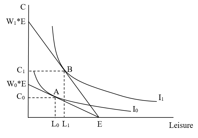
Our model of the worker's decision is outlined in the diagram below. The worker's decision is constrained by the amount of discretionary time available to them. Let's call this their time endowment, E. If they spent every hour of discretionary time on leisure, they would have E hours of leisure, but zero income. That is one end point of the worker's budget constraint, on the x-axis. The x-axis measures leisure time from left to right, but that means that it also measures work time (from right to left, because each one hour less leisure means one hour more of work). The difference between E and the number of leisure hours is the number of work hours. Next, if the worker spent every hour working, they would have zero leisure, but would have an income equal to W0*E (the wage, W0, multiplied by the whole time endowment, E). That is the other end point of the worker's budget constraint, on the y-axis. The worker's budget constraint joins up those two points, and has a slope that is equal to the wage (more correctly, it is equal to -W0, and it is negative because the budget constraint is downward sloping). The slope of the budget constraint represents the opportunity cost of leisure. Every hour the worker spends on leisure, they give up the wage of W0. Now, we represent the worker's preferences over leisure and consumption by indifference curves. The worker is trying to maximise their utility, which means that they are trying to get to the highest possible indifference curve that they can, while remaining within their budget constraint. The highest indifference curve they can reach on our diagram is I0. The worker's optimum is the bundle of leisure and consumption where their highest indifference curve meets the budget constraint. This is the bundle A, which contains leisure of L0 (and work hours equal to [E-L0]), and consumption of C0.

Now, consider what happens when the wage increases. Real wages (adjusted for inflation) increased a lot between 1880 and 1995. This is shown in the diagram below. For simplicity, let's assume that the worker's time endowment remained the same [*]. As the wage increases, the worker's budget constraint pivots outwards and becomes steeper. It has the same intercept on the y-axis x-axis (equal to the time endowment E), but if the worker spent every discretionary hour working, they would now have consumption (and income) equal to W1*E, where W1 is the new (higher) wage. Notice that the new budget constraint is steeper. This is because the slope of the budget constraint is equal to the wage, and the wage is now higher (and a higher value for the slope means a steeper line). The worker can now reach a higher indifference curve (I1). Their new optimal bundle of leisure and consumption is B, which contains leisure of L1 (and work hours equal to [E-L1]), and consumption of C1. Notice that the worker now consumes more leisure and more consumption as well. Because leisure has increased, that means that the number of work hours has decreased.

Coming back to the key facts we started this post with, the model does clearly show that, when wages go up, the worker will consume more leisure (and work less). Where did our original intuition go wrong?

Our original explanation, that as the wage increases the opportunity cost of leisure increases, and the worker will choose to work less, is the substitution effect of the change in the wage. However, when the relative price of two goods changes, the substitution effect is not the only thing that affects constrained decisions. There is also an income effect. In this case, the income effect says that, when wages go up, the worker can afford more consumption, but can also afford more leisure. Since both leisure and consumption are normal goods (we demand more as our income increases), the worker will want more leisure (and will want to work less). Over the period from 1880 to 1995, the income effect must have been larger than the substitution effect, and has driven the decrease in work hours (and increase in leisure hours).

Does this mean that increasing wages will always induce workers to work less? Of course not. The increase in real wages over the period from 1880 to 1995 was huge. And, no individual worker working in 1880 was still working in 1995, so no worker actually experienced the change we represented in our model. Most wage changes are much more modest, and it does appear that labour supply curves are generally upward sloping at the level of wages we observe over the short run. What that means is that the income effect is likely to be much smaller than what our diagram shows (and that would mean that L1 would be slightly to the left of L0. I'll leave drawing that situation as an exercise for you.

*****

[*] We know this isn't true, but it helps to make this assumption because we are more interested in the effect of the change in wages, and not the effect of the change in time endowment.

Thursday, 30 September 2021

Alarmism about global food prices misses an important part of the story

I was surprised when I read this article in The Conversation this week, by Alastair Smith (University of Warwick):

Global food prices shot up nearly 33% in September 2021 compared with the same period the year before. That’s according to the UN Food and Agriculture Organisation (FAO)‘s monthly Food Price Index, which also found that global prices have risen by more than 3% since July, reaching levels not seen since 2011.

The Food Price Index is designed to capture the combined outcome of changes in a range of food commodities, including vegetable oils, cereals, meat and sugar, and compare them month to month. It converts actual prices to an index, relative to average price levels between 2002 and 2004. This is the standard source for tracking food prices – nominal prices, as they’re known, which means they’re not adjusted for inflation.

While nominal prices tell us the monetary cost of buying food in the market, prices adjusted for inflation (what economists call “real” prices) are much more relevant to food security – how easily people can access appropriate nutrition. The prices of all goods and services tend to rise faster than average incomes (though not always). Inflation means that not only do buyers need to pay more per unit for food (due to its nominal price increase), but they have proportionately less money to spend on it, given the parallel price increases of everything else, except their wages and other incomes.

Back in August, I analysed the FAO’s inflation-adjusted Food Price Index and found that real global food prices were actually higher than in 2011, when food riots contributed to the overthrow of governments in Libya and Egypt.

The idea that "the prices of all goods and services tend to rise faster than average incomes" is flat out wrong. If it were true, then real wages would be declining, and so would living standards. But they're not (see the figures on pages 31-32 of the latest ILO Global Wage report for data covering 2006-2019). It gets worse though. On his blog (which The Conversation article links to), Smith wrote (emphasis in the original):

Sadly, while more precise than previous accounts, this messaging still misses the simple statistical observation that obliterates the relevance of this coverage. Reviewing the “real” price of food over time – expressed as an index relative to a base year, rather than the nominal value in currency, which makes comparison harder due to inflation – the only relevant way to capture today’s status of global food prices is to say that:

‘It is on average harder to buy food today in 2021, than it has been since 2012, and in fact for most of the noughties, the entire decade of the 1990s, and the 1980s; most of the 1970s, and every year of the 1960s! Food is more expensive today than it has been for most of the modern recorded history’.

Not only is it wrong, it's alarmist and wrong. It doesn't even take much economic sense to see why it is wrong. Consumers' decisions about how much food to buy depend on three things: (1) food prices; (2) the consumers' incomes; and (3) the consumers' preferences. If consumers' preferences haven't changed, then the amount of food that consumers buy depends on prices and their income.

If food prices go up, then consumers will buy less food. This is essentially the argument that Smith makes. However, if consumer incomes go up, then consumers will buy more food (because food is what economists call a normal good - that's a good that, by definition, consumers buy more of when their income increases). So, if food prices go up and consumer incomes go up, then consumers may buy less food, or they might buy more food. It crucially depends on how much consumers respond to the change in price, and how much they respond to the change in income. I'll come back to this point using an economic model a little bit later in this post.

But first, on his blog Smith has a figure that demonstrates that the Global Food Index (which tracks the real price of food, and is available here) is about 16.7 percent higher in 2021 than it was in 1961. However, global real gross national income (GNI) per capita (a measure of income per person) more than doubled between 1971 and 2019 (see the World Bank data here). Here's a graph that compares both series (GNI per capita, and Global Food Index) in terms of increases relative to 1971 (when the GNI data series starts). It is clear that incomes have risen far more than food prices over that time. So, it's hard to see how the data supports a claim that "It is on average harder to buy food today in 2021, than it has been since 2012... most of the 1970s, and every year of the 1960s!". Such hyperbole is completely unwarranted.

The comparisons that are made do matter. Food prices in 2021 are 21 percent higher than the average of 2014-2016, but incomes haven't grown nearly as much over that time period (GNI per capita increased by 8.8 percent from 2014-2019, and won't have grown enough in the past two years to match the food price increase). That change over recent years might support Smith's rhetoric (although the alarmist tone is arguable), but his use of the longer time period clearly does not. However, it's not really global food prices that matter for the destabilisation of societies, but local food prices in those societies. Smith could have crafted a much more compelling story by focusing on local changes rather than global.

Anyway, now we come to the economic model I promised earlier (which is the consumer choice model, and useful for ECONS101 students). This model is illustrated in the diagram below, which shows food on the x-axis, and 'all other goods' on the y-axis. The consumer buys a bundle of goods that is made up of food, and all other goods. When the price of food is low (PF0), the black budget constraint applies. The optimising consumer's best affordable choice is the bundle of goods E0, since it is on the highest indifference curve the consumer can reach (I0), while remaining within their feasible set (on the budget constraint). The consumer is buying F0 food. When food prices increase (to PF1), the budget constraint pivots inwards to the blue line and becomes steeper. The consumer can no longer afford the bundle of goods E0 (it is outside of the feasible set), so their new best affordable choice is the bundle of goods E1, since it is on the highest indifference curve the consumer can now reach (I1), while remaining within their new feasible set (i.e. on the new budget constraint). The consumer is worse off, because they are now on a lower indifference curve (which means that they receive less utility, or satisfaction, from their consumption), and they buy less food (F1).

When the price of food increases, there are really two things going on for the consumer. First, there is a substitution effect. Food has become relatively more expensive than all other goods, so the consumer buys less food (and substitutes some of their consumption to all other goods instead, because they have become relatively cheaper). Second, there is an income effect. The consumer's real income (or purchasing power) has decreased - they can afford to buy less in total than they could before. Since food is a normal good, the consumer buys less of it (and since the composite 'all other goods' is also a normal good, they also buy less of all other goods as well - the income effect explains why the increase in the price of food causes the consumer to buy less of all other goods, as well as less food). [*]

However, we are not done. Remember that, in addition to increasing food prices, consumer incomes have increased. If we compare the 1970s with today, the increase in income is far larger than the increase in food prices. This is illustrated in the diagram below (which also shows the situation from the diagram above). The red budget constraint shows the combined effect of the increase in prices to PF1 (the budget constraint becomes steeper) and the increase in consumer income to M2 (the budget constraint moves outwards, parallel to the budget constraint with the new food price). The consumer could have kept buying the bundle of goods E0. They won't though, because they can now reach a higher indifference curve (I2), by buying the bundle of goods E2. The consumer is much better off than before, because they are on a higher indifference curve (which means that they receive more utility, or satisfaction, from their consumption), and notice that the net effect is no change in food purchases at all (the consumer still buys F0 food).

Now consider the change over the more recent period from 2014-2021. This is shown in the diagram below. The food price has increased and consumer income has increased, but the increase in consumer income is now much less (to M3). The consumer cannot continue to buy the bundle of goods E0, because it is outside of the feasible set. Their new best affordable choice is the bundle of goods E3, since it is on the highest indifference curve the consumer can now reach (I3), while remaining within their new feasible set (i.e. on the new budget constraint). Their utility has decreased, as they are now on a lower indifference curve than before, and they buy less food (F3) than before.

Changes in food prices do matter for consumer utility (or satisfaction), and a big decrease in utility will make consumers unhappy. Perhaps a big decrease in utility will make consumers unhappy enough to cause civil unrest. However, food prices are not the only thing that matters for consumer utility. Consumers' incomes matter as well, and if consumer incomes increase faster than (or at least keep pace with) food prices, then it is difficult to see why that would be problematic. Focusing on food prices alone misses an important part of the story.

*****

[*] We could show the income and substitution effects on the diagram, but it isn't necessary for us to do so in order to explain them.

Saturday, 18 August 2018

Television viewing vs. sex

Consider two goods (A and B) that are substitutes - consumers tend to switch consumption towards the good that has become relatively cheaper when the relative price between the two goods changes. So, if the price of A falls, consumers will tend to buy more of A, and less of B. And if the price of A rises, consumers will tend to buy less of A, and more of B.

We can extend the idea of the relative price to consider the full cost of obtaining each good. So, if A becomes more difficult to find, the full cost of consuming A rises, and consumers will buy less of A, and more of B. And so on. Now consider two specific goods: television viewing and sex. Based on the basic model we just outlined, if the full cost of television viewing falls, then consumers will watch more television, and have less sex.

We can also illustrate this using the diagram below. Let's assume that the 'consumer' doesn't own a television. The 'consumer' has a choice of two goods: television viewing (on the x-axis) and sex (on the y-axis). They have limited time (say 20 hours per week), that they can spend on either activity, and this constraint is represented by the straight line (from 15 hours television viewing and no sex, to 20 hours of sex and no television viewing). They can only get to 15 hours of television watching rather than 20, because they have to find someone else who owns a television and will let them watch, and that takes up some time. The consumer will choose the point on their time constraint that is on the highest indifference curve (I0) which touches the time constraint at one point (E0), where they spend T0 hours watching television, and S0 hours having sex.
If the consumer buys their own television, they no longer have to spend time trying to find a television to watch somewhere else, so the full cost of television watching decreases. The time constraint pivots upwards (which represents a decrease in the relative price of television watching). The consumer can now reach a higher indifference curve (I1), and will maximise their utility by consuming at the point E1, where they now spend T1 hours watching television, and S1 hours having sex.

Notice that television watching has increased greatly (it is now cheaper and much more convenient), but time spend having sex has decreased. [*] So, television really might kill your sex life.

Is there evidence for this trade-off between television viewing and sex? In a new NBER Working Paper, Adrienne Lucas (University of Delaware) and Nicholas Wilson (Reed College) find suggestive evidence for a negative relationship between television ownership and coital frequency, using data from nearly 4 million individuals from 80 countries. Specifically, they find that:
...the results of the analysis are consistent with a small amount of substitutability between television viewing and sexual activity. We find that television ownership is associated with approximately a 5% reduction in sexual activity, a statistically significant yet not particularly large association.
The results are correlations rather than causal, but Lucas and Wilson at least eliminate some of the main potential confounders such as wealth or reproductive health knowledge. Interestingly, the effect seems to be concentrated among women (the coefficient of television ownership is not statistically significant for men). It's robust to the inclusion of other durable goods (refrigerator, radio, car, motorcycle, and bicycle). Interestingly though, owning a refrigerator is also negatively associated with coital frequency for women (but not men). Does that imply that night-time snacking is also a substitute for sex?

[HT: Marginal Revolution]

*****

[*] With the price change here, there are actually two effects: (1) a substitution effect (television watching has become relatively cheaper, and sex has become relatively more expensive, so the consumer should watch more television and have less sex); and (2) an income effect (the consumer now has more time because they don't have to waste time trying to find a television, so they both watch more television and spend more time having sex, because both activities are 'normal goods'). In my diagram, I've assumed that the income effect on time spent having sex is smaller than the substitution effect.

Tuesday, 24 July 2018

A stylised model of environment-GDP trade-offs

In ECONS101 last week, we covered constrained optimisation models. I spent most of the week's lectures working through examples with the consumer choice model, then at the end I introduced the worker's labour-leisure trade-off model, and then briefly the constrained optimisation model for savers (deciding between consumption today and consumption in the future). I also mentioned that the constrained optimisation model can be used in lots of other situations.

Over on The Visible Hand of Economics blog (good to see that it is back in business), Matt Nolan wrote a spirited defence of GDP as a measure of production, where at one point he wrote:
GDP is surprisingly nifty for these things … as long as we don’t always start with the unconditional prior “more GDPs are good”.  We need to ask “what is the trade-off that creates this GDP”.
Since trade-offs can often be described using the constrained optimisation models we covered in ECONS101 last week, it got me thinking about what such a model might look like. This is a stylised model so I'm making a number of un-stated assumptions, and there are a number of obvious criticisms of the model that you can read more about if you scroll to the notes at the bottom of the post.

First, we need two goods that our decision-maker has to choose between. In this case, let's consider a model of the trade-off between GDP and environmental quality. Our decision-maker in this case is a benevolent social planner (or the government, you choose). [*]

Next, we need to think about what constrains our decision-maker's decision about the quantity of GDP and quantity of environmental quality. In this case, it's resources. Resources (land, labour, capital variously defined) can be applied to produce stuff (increase GDP) or to increase environmental quality. This sets the trade-off as being more GDP (Y) or more environmental quality (Q) - if we want more production (higher GDP), then we end up with lower environmental quality, and if we want higher environmental quality, we end up with less production (lower GDP).

The constraint can be represented as a straight line on the diagram below. [**] To draw a straight line of course, we only need two points. One is the point where we use all of our resources on environmental quality and have no production at all (the point QMAX on the diagram); the other is the point where we use all of our resources on production and have no environmental quality at all (the point YMAX on the diagram). The trade-off between environmental quality and production is represented by the slope of the constraint - this is the opportunity cost of environmental quality (it is the amount of production we would have to give up to get one more unit of environmental quality, however it was measured). The opportunity cost of environmental quality is related to productivity, which is a point we will come back to a bit later in the post.

Lastly, we need to represent the decision-maker's preferences. As with other constrained optimisation models, we do this with indifference curves. Just like indifference curves in the consumer choice model (and other constrained optimisation models) the decision-maker is trying to get to the highest possible indifference curve, which is up to the right. [***] On the diagram below, the highest possible indifference curve is I0, and the optimal bundle of production and environmental quality is E0 (which includes Y0 production or GDP, and Q0 environmental quality). So, we can see that the optimum point contains some positive level of production, and some positive level of environmental quality.

Now we have constructed our model, we can do something useful with it. Let's consider the question: what happens when productivity increases? An increase in productivity means that we can produce more using the same amount of resources. In that case, the constraint in our model pivots outwards and becomes steeper, as in the diagram below. That's because, if we applied all of our resources to production, we could now produce more (so the constraint moves up on the y-axis from YMAX to YMAX1). The productivity increase doesn't affect the maximum environmental quality we could obtain (which stays at QMAX). The steeper constraint means that the opportunity cost of environmental quality has increased - we now need to give up more production for each unit of environmental quality than we did before.

What will the decision-maker do? They could keep operating at the previous optimum (E0), because it is in the feasible set. But they won't, because they can get to a higher indifference curve (remember that the decision-maker is trying to maximise utility by getting to the highest possible indifference curve). That highest possible indifference curve is now I1, and their optimum is the bundle E1 (which includes Y1 production or GDP, and Q1 environmental quality).

This result is interesting. First, notice that the opportunity cost of environmental quality has gone up. Usually, when the cost of something goes up, we would expect people to want less of it, but our decision-maker wants more (notice that Q1 is bigger than Q0). [****] That's because, when you change the relative price of two 'goods' (in this case, the relative price of environmental quality and production), two effects are simultaneously occurring: (1) a substitution effect; and (2) an income effect.

The substitution effect suggests that the decision-maker will want less environmental quality, because it has now become relatively more expensive (higher opportunity cost). Given that the quantity of environmental quality has actually increased, that tells us that the income effect is working in the opposite direction, and is bigger than the substitution effect. In this case, the income effect works like this: the pivoting outwards of the constraint increases the 'purchasing power' of the decision-maker's resources, in the sense that they can purchase more production and more environmental quality (we can refer to this as an increase in their real income). Both production and environmental quality are normal goods (goods that we want to consume more of when our incomes increase), so because the decision-makers real income has increased, they want to consume more environmental quality as a result of this income effect.

So, that's a simple stylised model of environment-GDP trade-offs, with some illustration of how it can be used to explain decisions. It's an example of a constrained optimisation model, but in quite a different context from how it is usually presented in class.

*****

[*] Aggregating the preferences for many people into a single set of aggregate preferences leads to the problem described in Arrow's Impossibility Theorem. To avoid that problem (or to embrace it), we'll just assume there is a single decision-maker (who Kenneth Arrow labelled a 'dictator'), whose preferences (their indifference curves) represent those of society as a whole.

[**] A more realistic model would recognise that resources are not equally useful for production as for increasing environmental quality, and so the opportunity cost is not constant. That means that the constraint is not a straight line, but a curved line (bowed out away from the origin). Some of you would recognise that as a production possibilities frontier, and you would be right - this is a model of constrained production, not constrained consumption. Simplifying the model by assuming that the opportunity cost of environmental quality is constant just makes the model a bit easier to draw, but is otherwise not consequential in terms of the qualitative results we get from the model.

[***] The indifference curves here are curved because of diminishing marginal utility (just as they are in most constrained optimisation models). We gain extra utility (satisfaction) from more production, and from more environmental quality. However, the extra utility we get from one more unit (of production, or of environmental quality) diminishes as we get more of it. Maybe you would argue that there is not diminishing marginal utility of environmental quality (at least, some people would). However, you only need diminishing marginal utility of one of the goods in order for the indifference curves to be curved.

[****] Of course, it is also possible to draw the diagram in such a way that the quantity of environmental quality decreases after the change. The difference is purely a result of differences in the shape of the indifference curves. The case where environmental quality increases is more interesting, which is why I focus on it here.

Wednesday, 2 December 2015

What coffee farmers do with certification

This is my third post on Fair Trade this week (see the earlier posts here and here). Having discussed what Fair Trade does for prices (not much) and incomes (also not much), it's worth asking whether there is a better alternative.

In a new paper in the journal World Development (sorry I don't see an ungated version anywhere), Bart van Rijsbergen, Willlem Elbers (both Radboud University in the Netherlands), Ruerd Ruben (Wageningen University), and Samuel Njuguna (Jomo Kenyatta University of Agriculture and Technology in Kenya) compare Utz certification with Fair Trade certification, based on data from 218 coffee farmers in Kenya. Importantly, they use a propensity score matching approach (which I discussed briefly in this earlier post) to make the comparisons.

The key difference between Utz certification and Fair Trade is that Utz focuses on improved agricultural practices (that should result in higher coffee quality), while Fair Trade instead provides a price premium, as discussed in my earlier posts. Some of the surveyed coffee farmers held both certifications, some were Fair Trade only, and some were non-certified. Here's what they find:
Whereas Fairtrade clearly enhances further specialization in coffee production and more engagement in dry coffee processing, Utz-certified enhances input-intensification of coffee production and multi-certification opts for coffee renovation and the diversification of coffee outlets...
...household welfare and livelihood effects of coffee certification remain generally rather disappointing.
Neither certification scheme had much effect on income, mainly because farms only derived one-quarter to one-third of their income from coffee sales, and certified coffee sales were only around one-third of that income.

Which brings me to this other new paper I read today from the journal Food Policy (ungated here), by Wytse Vellema (Ghent University), Alexander Buritica Casanova (CIAT), Carolina Gonzalez (CIAT and IFPRI), and Marijke D'Haese (Ghent University). In the paper the authors use data from coffee farmers in Colombia , where they also note that coffee is only one (of several) income sources for most farm households. Their comparisons rely on cross-sectional mean differences (rather than a matching approach), so their results need to be treated with a little bit of caution.

Again, they find little effect of coffee certification (this time the certification is mostly Starbucks C.A.F.E. and Nespresso AAA) on household incomes. However, what caught my eye about the paper was the discussion of income and substitution effects for coffee farmers:
Having farm certification reduced income from on-farm agricultural production [MC: excluding coffee production] and agricultural wage labour, likely indicating re-allocation of resources away from these activities. Such re-allocation of labour is driven by substitution and income effects. As total household labour is fixed, increased returns to one activity cause households to substitute labour away from other activities. Households are most likely to substitute labour away from activities with low return or which are considered less ’satisfying’... Income effects lead to an increased consumption of leisure, reducing overall hours worked. The negative combined impact on incomes from on-farm agricultural production and agricultural labour shows that substitution effects dominate income effects.
As we discuss in ECON100, because with certification coffee production is more rewarding farmers reallocate their labour time to that activity and away from farming other products and from agricultural wage labour (substitution effect). Higher income from coffee leads them to consume more leisure, reducing their labour allocation to all farming activities (income effect). The overall effect on farm household income is negligible (Vellema et al. note that coffee income increased, but overall income did not).

One last point is important here. There appears to be an increasing proliferation of certification schemes, and many farmers hold multiple certifications (in the Vellema et al. paper, about 29% of the sample held two certifications, and 6% held three certifications). For farmers, the marginal benefit of an additional certification probably decreases as they get more certified (since a good proportion of their crop is able to be sold through their existing certified channels), while the marginal cost probably increases (the opportunity costs involved with spending time maintaining multiple, and possibly conflicting, certifications). I wonder, what is the optimal number of certifications for a given coffee farmer?

Read more: