Showing posts with label Comparative advantage. Show all posts

Monday, 11 August 2025

International trade and the domestic price of butter in New Zealand

If you're in New Zealand, you probably couldn't avoid the news over the last six months about the price of butter. In case you missed it though, this New Zealand Herald article from January explains:

The price of butter has topped $9 for a 500g block in some shops and one analyst is warning prices could stay high for months due to global butter supply shortages...

A spokesperson for New World and Pak’nSave operator Foodstuffs said any change in supplier pricing had a direct impact on the price for customers.

“The price of butter on our shelves is primarily influenced by the broader dairy market and the wholesale costs set by our suppliers,” the spokesperson said.

“Over the past 18 months, global butter commodity costs have risen by around 43%...

ANZ agricultural economist Susan Kilsby said butter prices had lifted by 24% over the past year in the global markets.

“Demand for cream [which is used to make butter] does tend to peak over the Christmas holiday period which tightens supply available for butter,” Kilsby said.

“Butter has been in short supply in some parts of the world, as dairy production is relatively stagnant in many markets, whilst demand continues to lift.”

Unfortunately for Kiwi consumers, Kilsby expected butter prices to stay relatively high for the next three to six months.

Let's unpack what's going on with the price of butter. First, let's consider the impact of international trade. This is shown in the diagram below. New Zealand is an exporting country, which means that New Zealand has a comparative advantage producing butter (and other dairy products). That means that New Zealand can produce butter at a lower opportunity cost than other countries. On a supply-and-demand diagram like the one below, it means that the domestic market equilibrium price of butter (PD) would be below the price of butter on the world market (PW0). Because the domestic price is lower than the world price, if New Zealand is open to trade there are opportunities for traders to buy butter in the domestic market (at the price PD), and sell it on the world market (at the price PW0) and make a profit (or maybe the suppliers themselves sell directly to the world market for the price PW0). In other words, there are incentives to export butter. The rest of the world is willing to buy as much butter as we are willing to supply. [*] So, the demand curve in the domestic market for butter becomes D+exports (the red line in the diagram). The price in the domestic market is determined by the intersection of that demand curve and the supply curve, which is the price PW0. The domestic consumers end up having to pay the price PW0 for butter, since they are competing with the world price (and who would sell at the lower price PD when they could sell on the world market for PW0 instead?). At this higher price, the domestic consumers choose to purchase Qd0 butter, while the domestic dairy farmers sell Qs0 butter (assuming that the world market could absorb any quantity of butter that was produced). The difference (Qs0 - Qd0) is the quantity of butter that is exported.

In terms of economic welfare, if there was no international trade in butter, the market would operate at the domestic equilibrium, with price PD and quantity Q0. Consumer surplus (the gains to domestic timber consumers) would be the area AEPD, the producer surplus (the gains to domestic dairy farmers) would be the area PDEF, and total welfare (the sum of consumer surplus and producer surplus, or the gains to society overall) would be the area AEF. With trade, the consumer surplus decreases to ABPW, the producer surplus increases to PWCF, and total welfare increases to ABCF. Since total welfare is larger (by the area BCE), this represents the gains from trade. So to summarise, exporting butter makes domestic butter consumers worse off (lower consumer surplus), domestic dairy farmers better off (higher producer surplus), and society overall better off (higher total welfare).

Now consider how the increase in worldwide demand for butter (as noted in the article) affects the world market for butter, as shown in the diagram below. World demand has increased from DW0 to DW1, and that increases the equilibrium world price from PW to PW1.

Now, let's go back to the New Zealand domestic market for butter. The world price has increased from PW to PW1, as shown in the diagram below, and demand including trade has moved up from D+exports to D+exports1. Now, the domestic consumers have to pay the higher price PW1 for butter, since they are still competing with the world price (and the world price is now higher). At this higher world price, the domestic consumers now choose to purchase Qd1 butter, while the domestic dairy farmers now sell Qs1 butter (still assuming that the world market could absorb any quantity of butter that was produced). The quantity of exports is now (Qs1 - Qd1). That means that more butter is now being exported.

What does that mean for economic welfare? With the higher world price, the consumer surplus decreases further to AGPW1, the producer surplus increases further to PW1HF, and total welfare increases further to AGHF. In other words, the increase in the world price of butter makes domestic consumers worse off, but it makes domestic dairy farmers better off, and society overall better off.

While we might like dairy farmers to sell us butter at a lower price than they can receive from the world market, there is little incentive for them to do so. New Zealand butter consumers must pay the world price of butter. The world price has increased, so the domestic price of butter must increase as well. That higher butter price makes dairy farmers (and society overall) much better off. However, that will come as cold comfort to households that must pay a small fortune to butter their toast.

*****

[*] This assumes that the domestic market for butter in New Zealand is a small proportion of the total world market, such that domestic supply and demand do not affect the world price. For butter, that is unlikely to be true, as New Zealand exports a substantial proportion of global butter supply. However, for the purposes of this analysis, it doesn't have a big impact since we are not considering changes in domestic market conditions.

Tuesday, 3 September 2024

China's export restrictions on resources for semiconductors

The Financial Times reported last week (paywalled):

Chinese export controls on crucial semiconductor materials are hitting supply chains and stoking fears of shortfalls in western production of advanced chips and military optical hardware.

Beijing’s curbs on shipments of germanium and gallium, which are used for semiconductor applications and military and communications equipment components, have led to an almost twofold increase in the minerals’ prices in Europe over the past year.

China introduced the restrictions, which it says safeguard its “national security and interests”, last year in response to US-led controls on sales of advanced chips and chipmaking equipment.

The FT article focuses on the effect of the export controls on Europe. However, I want to look at the effect of the export controls (an export quota) on the prices of the resources (gallium and germanium) in China. However, let's start by considering why China is an exporter, and the gains from trade for China. This is demonstrated in the diagram below. China has a comparative advantage producing these resources. That means that China can produce gallium (or germanium) at a lower opportunity cost than other countries. On a supply-and-demand diagram like the one below, it means that the domestic market equilibrium price of gallium (PD) would be below the price of gallium on the world market (PW). Because the domestic price is lower than the world price, if China is open to trade there are opportunities for traders to buy gallium in the domestic market (at the price PD), and sell it on the world market (at the price PW) and make a profit (or maybe the suppliers themselves sell directly to the world market for the price PW). In other words, there are incentives to export gallium. The domestic consumers would end up having to pay the price PW for gallium as well, since they would be competing with the world price (and who would sell at the lower price PD when they could sell on the world market for PW instead?). At this higher price, the domestic consumers choose to purchase Qd0 gallium, while the domestic suppliers sell Qs0 gallium (assuming that the world market could absorb any quantity of gallium that was produced). The difference (Qs0 - Qd0) is the quantity of gallium that is exported. Essentially the demand curve with exports follows the red line in the diagram.

In terms of economic welfare, if there was no international trade in gallium, the market would operate at the domestic equilibrium, with price PD and quantity Q0. Consumer surplus (the gains to domestic gallium consumers) would be the area AEPD, the producer surplus (the gains to domestic gallium producers) would be the area PDEF, and total welfare (the sum of consumer surplus and producer surplus, or the gains to society overall) would be the area AEF. With trade, the consumer surplus decreases to ABPW, the producer surplus increases to PWCF, and total welfare increases to ABCF. Since total welfare is larger (by the area BCE), this represents the gains from trade.

Now consider what would happen if there is an export quota limiting the quantity of gallium exports below (Qs0 - Qd0). This is shown in the diagram below. Let's say that the quantity of exports is reduced to the amount between B and G on the diagram (about half the amount of exports that were previously occurring). Now consider what happens to the demand curve (including exports). The upper part represents the domestic consumers with high willingness-to-pay for gallium. Then there is a limited quantity of exports that are allowed under the export quota, at the world price PW. After that, there are still profit opportunities for domestic suppliers (that is, there are still some domestic consumers who are willing to pay more than what it costs the suppliers to produce gallium). So, the demand curve (including the export quota) pivots at the point G, and follows a parallel path to the original demand curve (i.e. the demand curve including exports follows the red line in the diagram). The domestic price is the price where supply is equal to demand (P1). The domestic consumers choose to purchase Qd1 gallium at the price P1, while the domestic suppliers sell Qs1 gallium at that price. The difference (Qs1 - Qd1) is the quantity of exports of gallium.

Now consider the areas of economic welfare. The consumer surplus is larger than it was without the restricted exports (it is now the area AJP1), the producer surplus is smaller than it was without the restricted exports (it is now the area P1HF). There is a new area of welfare KLHJ, which is the profit that exporters of gallium would receive from exporting, because they can purchase the gallium at the price P1 domestically, and then sell it to the world market at the price PW. This area KLHJ is the licence-holder surplus. Total welfare is smaller than without the restricted exports (it is now the area AJHF+KLHJ). There is a deadweight loss (a loss of total welfare arising from the restricted exports) equal to the area [BKJ + LCH] - these areas were part of total welfare with trade and no restricted exports, but have now been lost. The reduction in exports makes domestic gallium suppliers worse off, as well as society overall (in terms of economic welfare in total). However, domestic gallium consumers benefit in terms of higher consumer surplus, and the export licence holders are a new group that gains from these restrictions.

Now, the model we used above relies on an assumption that Chinese decisions about gallium (or germanium) exports do not affect the world price. In fact, because China produces 98 percent of the world's gallium, and 60 percent of the world's germanium (according to the FT article), this is unlikely to be true. When China restricts exports through the quota, the world price will increase. That has the effect of increasing the surplus for the export licence holders, but otherwise doesn't affect domestic consumers or producers. However, it will make international consumers worse off, since they would now have to pay a higher price for gallium. And that's what the FT article shows. However, now we know that it isn't just the global consumers of these resources who are worse off, but Chinese mining companies, and Chinese society generally, as well.

Thursday, 12 August 2021

Chinese and world demand, and the price of beef in New Zealand

When a country is open to international trade, the prices in the domestic economy don't only reflect domestic factors, but are also affected by changes in the international market as well. Consider this recent story from the New Zealand Herald:

If you feel like red meat is more expensive than it used to be, you're right.

Around 95 percent of New Zealand's sheep meat and 87 percent of beef is exported, and what's left behind for locals is being sold at a premium.

In January 2007, 1kg of beef mince would have cost $9 according to Stats NZ's food price index. If you put a pack in your shopping trolley in January this year, it would have cost $16.39...

Beef + Lamb NZ chief executive Rod Slater said the cost of meat in New Zealand reflected what markets overseas were willing to pay...

One of the emerging buyers for our red meat is China.

African swine flu decimated the country's pig numbers in 2018 and former trade negotiator and founder of consultancy Sanders Unsworth Charles Finny said this was why China had been importing more beef and lamb.

Consider the domestic market for beef, as shown in the diagram below. New Zealand is an exporting country, which means that New Zealand has a comparative advantage producing beef. That means that New Zealand can produce beef at a lower opportunity cost than other countries. On a supply-and-demand diagram like the one below, it means that the domestic market equilibrium price of beef (PD) would be below the price of beef on the world market (PW). Because the domestic price is lower than the world price, if New Zealand is open to trade there are opportunities for traders to buy beef in the domestic market (at the price PD), and sell it on the world market (at the price PW) and make a profit (or maybe the suppliers themselves sell directly to the world market for the price PW). In other words, there are incentives to export beef. The domestic consumers would end up having to pay the price PW for beef as well, since they would be competing with the world price (and who would sell at the lower price PD when they could sell on the world market for PW instead?). At this higher price, the domestic consumers choose to purchase Qd0 beef, while the domestic beef farmers sell Qs0 beef (assuming that the world market could absorb any quantity of beef that was produced). The difference (Qs0 - Qd0) is the quantity of beef that is exported. Essentially the demand curve with exports follows the red line in the diagram.

In terms of economic welfare, if there was no international trade in beef, the market would operate at the domestic equilibrium, with price PD and quantity Q0. Consumer surplus (the gains to domestic timber consumers) would be the area AEPD, the producer surplus (the gains to domestic beef farmers) would be the area PDEF, and total welfare (the sum of consumer surplus and producer surplus, or the gains to society overall) would be the area AEF. With trade, the consumer surplus decreases to ABPW, the producer surplus increases to PWCF, and total welfare increases to ABCF. Since total welfare is larger (by the area BCE), this represents the gains from trade. So to summarise, exporting beef makes domestic beef consumers worse off (lower consumer surplus), domestic beef farmers better off (higher producer surplus), and society overall better off (higher total welfare).

Now consider how the change in demand from China affects the world market for beef, as shown in the diagram below. World demand has increased from DW0 to DW1, and that increases the equilibrium world price from PW to PW1.

Now, let's go back to the New Zealand domestic market for beef. The world price has increased from PW to PW1, as shown in the diagram below. Now, the domestic consumers have to pay the higher price PW1 for beef, since they are still competing with the world price (and the world price is now higher). At this higher world price, the domestic consumers now choose to purchase Qd1 beef, while the domestic beef farmers now sell Qs1 beef (still assuming that the world market could absorb any quantity of beef that was produced). The quantity of exports is now (Qs1 - Qd1). That means that more beef is now being exported.

What does that mean for economic welfare? With the higher world price, the consumer surplus decreases further to AGPW1, the producer surplus increases further to PW1HF, and total welfare increases further to AGHF. In other words, the increase in the world price of beef makes domestic consumers worse off (which is what the article notes), but it makes domestic beef farmers better off, and society overall better off.

Domestic consumers are affected by events on the world market, when the domestic market is open to international trade. However, openness to international trade is not all bad news for consumers. If international demand falls, the domestic price will fall and consumer surplus will increase (essentially, the opposite of the example above). And, New Zealand is not an exporter in all markets. In markets where New Zealand is a net importer, prices are lower, and consumer surplus is higher, than they would be without trade.

Tuesday, 10 August 2021

The effect of timber export restrictions on the domestic market for timber

The housing crisis is causing the government to search frantically for solutions. As the New Zealand Herald reported last week:

The Government was warned its efforts to tackle New Zealand's housing affordability issues could be hampered by wood shortages.

The issue has become so significant, Building and Construction Minister Poto Williams is considering limiting timber exports to ensure there is enough in the country.

What happens if the government limits timber exports, by implementing an export quota? Before we can answer that question, we need to consider the effect of exports on the domestic market, without any restrictions on exports. That situation is shown in the diagram below. New Zealand is an exporting country, which means that New Zealand has a comparative advantage producing timber. That means that New Zealand can produce timber at a lower opportunity cost than other countries. On a supply-and-demand diagram like the one below, it means that the domestic market equilibrium price of timber (PD) would be below the price of timber on the world market (PW). Because the domestic price is lower than the world price, if New Zealand is open to trade there are opportunities for traders to buy timber in the domestic market (at the price PD), and sell it on the world market (at the price PW) and make a profit (or maybe the suppliers themselves sell directly to the world market for the price PW). In other words, there are incentives to export timber. The domestic consumers would end up having to pay the price PW for timber as well, since they would be competing with the world price (and who would sell at the lower price PD when they could sell on the world market for PW instead?). At this higher price, the domestic consumers choose to purchase Qd0 timber, while the domestic suppliers sell Qs0 timber (assuming that the world market could absorb any quantity of timber that was produced). The difference (Qs0 - Qd0) is the quantity of timber that is exported. Essentially the demand curve with exports follows the red line in the diagram.


In terms of economic welfare, if there was no international trade in timber, the market would operate at the domestic equilibrium, with price PD and quantity Q0. Consumer surplus (the gains to domestic timber consumers) would be the area AEPD, the producer surplus (the gains to domestic timber producers) would be the area PDEF, and total welfare (the sum of consumer surplus and producer surplus, or the gains to society overall) would be the area AEF. With trade, the consumer surplus decreases to ABPW, the producer surplus increases to PWCF, and total welfare increases to ABCF. Since total welfare is larger (by the area BCE), this represents the gains from trade.

Now consider what would happen if there is an export quota limiting the quantity of timber exports below (Qs0 - Qd0). This is shown in the diagram below. Let's say that the quantity of exports is reduced to the amount between B and G on the diagram (about half the amount of exports that were previously occurring). Now consider what happens to the demand curve (including exports). The upper part represents the domestic consumers with high willingness-to-pay for timber. Then there is a limited quantity of exports that are allowed under the export quota, at the world price PW. After that, there are still profit opportunities for domestic suppliers (that is, there are still some domestic consumers who are willing to pay more than what it costs the suppliers to produce timber). So, the demand curve (including the export quota) pivots at the point G, and follows a parallel path to the original demand curve (i.e. the demand curve including exports follows the red line in the diagram). The domestic price is the price where supply is equal to demand (P1). The domestic consumers choose to purchase Qd1 timber at the price P1, while the domestic suppliers sell Qs1 timber at that price. The difference (Qs1 - Qd1) is the quantity of exports. Notice that the price of timber that timber consumers pay has fallen, and more timber is purchased domestically - we'll come back to those points shortly.

Now consider the areas of economic welfare. The consumer surplus is larger than it was without the restricted exports (it is now the area AJP1), the producer surplus is smaller than it was without the restricted exports (it is now the area P1HF plus the area KLHJ. The first area (P1HF) is producer surplus as if the farmers sold all of their products to the domestic market, while the second area (KLHJ) is the extra profits the suppliers get from selling the quota of exports. Total welfare is smaller than without the restricted exports (it is now the area AJHF+KLHJ). There is a deadweight loss (a loss of total welfare arising from the restricted exports) equal to the area [BKJ + LCH] - these areas were part of total welfare with trade and no restricted exports, but have now been lost. The reduction in exports makes timber suppliers worse off, as well as society overall (in terms of economic welfare in total). However, timber consumers benefit in terms of higher consumer surplus.

Now consider the goals of the export quota. If the government is worried that domestic timber prices are too high, the export quota will lower the price (from PW to P1). If the government is worried that not enough timber is available and sold locally, the export quota will increase that quantity (from Qd0 to Qd1). It sounds like the export quota will have all the effects that the government might want. However, there is no free lunch here. Domestic timber producers are made worse off, and by more than the amount that domestic timber consumers gain (we know this because total welfare overall declines).

The negative impact on domestic timber producers is going to create a couple of negative incentives. First, at the margin it will dissuade timber growers from planting forests, because the return on investment will be lower (as timber prices are lower). Of course, that's not going to impact the market until 20-25 years into the future, so the current government might not care. Second, timber growers might prefer to leave their forests uncut, hoping that the export quota is lifted after the next change in government. If prices are low now, but there is an anticipated higher price in the future, then holding back supply might be a good strategy for some timber growers. That will have the opposite effect from what the government intends, because a reduced domestic supply of timber raises the domestic price, and decreases the quantity of domestic timber sold. This effect seems very likely to me.

The government needs to tread carefully, lest they create incentives that actually make the problem worse in the long run. Policy alternatives that encourage timber supply, rather than discouraging it, are likely to be more effective overall.

Sunday, 11 April 2021

Reduced exports due to border restrictions and the domestic market for strawberries

Last week, my ECONS102 class covered international trade, including the effects of trade restrictions on economic welfare. Usually, the examples I use involve the government interfering in the market, through the use of quotas or tariffs, and those trade policies invariably lead to a loss of economic welfare (a deadweight loss). However, sometimes other things get in the way of international trade, such as this recent example from HortNews:

Strawberry prices fell 43% in November 2020 as Covid-19 border restrictions reduced exports, Stats NZ said.

Consumer prices manager Katrina Dewbery says that fewer exports have meant there is more supply available for domestic consumption.

Prices averaged $3.45/250g punnet in November, down from $6.04 in October.

“Prices are lower than we typically see for a November month with December generally being when they are cheapest. Some people may be seeing even cheaper prices during the first half of December,” Dewbery said.

There was no government intervention here, but a lack of capacity to export strawberries due to the COVID-19 border restrictions reduced the quantity that could be exported. We could interpret that as being similar to an export quota on strawberries (where the quantity of exports was restricted to less than it would have been with open borders), so let's look at the effect on the market for strawberries.

First, consider the case without any border restrictions. This is shown in the diagram below. New Zealand is an exporting country, which means that New Zealand has a comparative advantage producing strawberries. That means that New Zealand can produce strawberries at a lower opportunity cost than other countries. On a supply-and-demand diagram like the one below, it means that the domestic market equilibrium price of strawberries (PD) would be below the price of strawberries on the world market (PW). Because the domestic price is lower than the world price, if New Zealand is open to trade there are opportunities for traders to buy strawberries in the domestic market (at the price PD), and sell it on the world market (at the price PW) and make a profit (or maybe the suppliers themselves sell directly to the world market for the price PW). In other words, there are incentives to export strawberries. The domestic consumers would end up having to pay the price PW for strawberries as well, since they would be competing with the world price (and who would sell at the lower price PD when they could sell on the world market for PW instead?). At this higher price, the domestic consumers choose to purchase Qd0 strawberries, while the domestic suppliers sell Qs0 strawberries (assuming that the world market could absorb any quantity of strawberries that was produced). The difference (Qs0 - Qd0) is the quantity of strawberries that is exported. Essentially the demand curve with exports follows the red line in the diagram.


In terms of economic welfare, if there was no international trade in strawberries, the market would operate at the domestic equilibrium, with price PD and quantity Q0. Consumer surplus (the gains to domestic strawberry consumers) would be the area AEPD, the producer surplus (the gains to domestic strawberry producers) would be the area PDEF, and total welfare (the sum of consumer surplus and producer surplus, or the gains to society overall) would be the area AEF. With trade, the consumer surplus decreases to ABPW, the producer surplus increases to PWCF, and total welfare increases to ABCF. Since total welfare is larger (by the area BCE), this represents the gains from trade.

Now consider what would happen if the quantity of strawberry exports was restricted below (Qs0 - Qd0). This is shown in the diagram below as an export quota. Let's say that the quantity of exports is reduced to the amount between B and G on the diagram (about half the amount of unrestricted exports). Now consider what happens to the demand curve (including exports). The upper part represents the domestic consumers with high willingness-to-pay for strawberries. Then there is a limited quantity of exports that can get through the border restrictions, at the world price PW. After that, there are still profit opportunities for domestic suppliers (that is, there are still some domestic consumers who are willing to pay more than what it costs the suppliers to produce strawberries). So, the demand curve (including the export quota) pivots at the point G, and follows a parallel path to the original demand curve (i.e. the demand curve including exports follows the red line in the diagram). The domestic price is the price where supply is equal to demand (P1). The domestic consumers choose to purchase Qd1 strawberries at the price P1, while the domestic suppliers sell Qs1 strawberries at that price. The difference (Qs1 - Qd1) is the quantity of exports. Notice that the price of strawberries that consumers pay has fallen, just as the article linked above noted.

Now consider the areas of economic welfare. The consumer surplus is larger than it was without the restricted exports (it is now the area AJP1), the producer surplus is smaller than it was without the restricted exports (it is now the area P1HF plus the area KLHJ. The first area (P1HF) is producer surplus as if the farmers sold all of their products to the domestic market, while the second area (KLHJ) is the extra profits the farmers get from selling the limited amount of exports that are able to get through the border restrictions. Total welfare is smaller than without the restricted exports (it is now the area AJHF+KLHJ). There is a deadweight loss (a loss of total welfare arising from the restricted exports) equal to the area [BKJ + LCH] - these areas were part of total welfare with trade and no restricted exports, but have now been lost.

The lost exports make strawberry farmers worse off, as well as society overall (in terms of economic welfare in total). However, strawberry consumers are the unwitting recipients of a gain. The interesting thing here is that the government is not responsible for the deadweight loss - this is a deadweight loss caused by a more general disruption in international trade. And it was not just strawberries that were affected - domestic consumers will have been made better off in all exported commodities that cannot be stored for long periods of time.

Tuesday, 23 June 2020

More on comparative advantage and the gender gap in STEM

Back in 2018, I wrote a post on comparative advantage and the gender gap in STEM, based on two research papers, where I noted:
So, even though female students may be better than male students in STEM subjects at school, we may see fewer of them studying those subjects at university (let alone taking them as a career), because female students are also better in non-STEM subjects at school, and they are better by more in non-STEM than in STEM, compared with male students. Economists refer to this as the students following their comparative advantage. Female students have a comparative advantage in non-STEM, and male students have a comparative advantage in STEM subjects.
In this post, I want to build on that by summarising two other research papers. The first is this article by Thomas Breda (Paris School of Economics) and Clotilde Napp (Paris-Jourdan Sciences-Economiques), published in the journal Proceedings of the National Academy of Sciences in 2018 (open access). Breda and Napp used data from the 2012 wave of PISA, covering some 300,000 15-year-old students across 64 countries. They showed that, in the PISA data:
...boys outperform girls in math by about 10% of a SD... In contrast, girls outperform boys by about a third of a SD in reading. Together, these observations suggest that girls have a comparative advantage in reading, something that appears more strikingly when we look at the gender gap in the difference between math and reading (MR) ability....
Breda and Napp then construct a measure of students' intentions to pursue maths-intensive studies and careers. They found that:
The gender gap in intentions cannot be explained by differences in math ability across genders...
That makes a lot of sense, because simply being good at maths isn't enough to encourage students to follow through on math. That depends on their comparative advantage - that is, is the student good at maths but better at other disciplines? When looking at the relationship between intensions and the difference between maths and reading (MR), Breda and Napp found that:
...the gender gap in intentions to pursue math-intensive studies and careers disappears almost entirely when one controls for individual-level differences in ability between math and reading.
In other words, the intention to study maths is more associated with the difference between maths and reading ability than it is by maths ability alone. On top of that, the difference between maths and reading ability does a better job of explain intentions than self-perceived maths ability.

The second paper (still a working paper), by Sofoklis Goulas (Stanford University), Silvia Griselda (University of Melbourne), and Rigissa Megalokonomou (University of Queensland), takes the concept of comparative advantage one step further. Their concept of comparative advantage is not just the difference between a high school student's average performance in STEM and non-STEM subjects, compared with the differences for other students in their class. What Breda and Napp refer to as comparative advantage, Goulas et al. refer to as absolute advantage. I think I prefer the Goulas et al. conception, because it more clearly conforms to what we think of as comparative advantage in a trade context - comparing opportunity costs of production between countries is analogous to comparing relative performance in STEM/non-STEM between students. A within-student comparison (like Breda and Napp) is more like a within-country comparison of production costs, i.e. absolute advantage.

Anyway, Goulas et al. have data from over 70,000 Grade 10 Greek students from 123 high schools over the period from 2001 to 2009. One of the interesting aspects of their data is that these students are assigned to classes automatically based on their surname (alphabetically). This means that they are essentially randomly allocated to classroom peers, which is important in overcoming selection bias (as I noted in Sunday's post on peer effects). Their measure of comparative advantage was the in-class ranking for each student, in terms of the difference in their average grades between STEM (algebra, physics, and chemistry) and non-STEM (modern Greek, Greek literature, and ancient Greek). Class ranking is a measure of relative performance in the class, for a group of students that it would be natural for students to compare themselves to (and for whom they probably have good information about).

Using this measure, Goulas et al. found that:
Females perform, on average, significantly higher than males in almost every subject... females' over-performance are even higher in non-STEM (=1.594) compared to STEM (=0.349)... Combining these, females have a lower comparative advantage in STEM subjects compared to males (0.409 for females and 0.487 for males).
Making use of their measures of absolute advantage (difference in average grades) and comparative advantage (within-class rank), they then look at the effects on future applications to STEM programmes in Grade 11. Focusing on the comparative advantage results, they found that:
The estimated coefficient of comparative STEM advantage is not significant for males but it is significant and equal to 0.19 for females (=0.030+0.161). This means that females who are ranked at the top of their classroom distribution in grade 10, are roughly 19% more likely to enroll in a STEM track in grade 11 than females who are ranked at the bottom of their classroom distribution, ceteris paribus...
Our findings suggest that between 4 and 6 percentage points of the 34-percentage-point gender gap (or 12-18%) in initial STEM specialization in high school are attributable to the influence of the comparative STEM advantage.
Looking at longer-term outcomes, Goulas et al. also find that comparative advantage in STEM in Grade 10 leads to a higher probability of applying to a degree-level STEM programme in university. The difference between being at the top and being at the bottom of the classroom distribution leads to a 10 percent higher likelihood of applying to a STEM degree programme. These results all appear to hold when comparing only with classmates of the same gender, when comparing at the school level rather than the class level, when changing the definition of what counts as STEM or non-STEM, and in a number of other robustness checks.

So, why does comparative advantage have such a large effect for female students, but not male students? Goulas et al. pose two mechanisms. First, they suggest lower monetary returns for women in STEM-related fields, which reduces the returns to STEM-related study. However, this is hard to reconcile with the Breda and Napp paper, which notes that the gender wage gap in STEM-related occupations is lower than for non-STEM-related occupations. The second mechanism is different preferences for STEM occupations. STEM occupations tend to be more competitive, and there is a gender gap in competitiveness (see this 2014 post, for example). Societal and environmental influences (including parents), and a lack of role models (which has been suggested as an important factor in female students not studying economics) could also contribute to this.

Coming back to the Breda and Napp article, they have an interesting suggestion on how to close the gender gap in enrolments, given the high contribution of comparative advantage:
As the gender gap in reading performance is much larger than that in math performance, policymakers may want to focus primarily on the reduction of the former. Systematic tutoring for low reading achievers, who are predominantly males, would be a way, for example, to improve boys’ performance in reading.
Redirecting education resources towards boys in order to reduce the gender gap in STEM would no doubt strike many people as counter-intuitive. It also comes with ethical issues. If STEM-related occupations are higher paying, then redirecting (male) students so that they instead study non-STEM-related subjects doesn't necessarily strike me as morally unambiguous solution. Breda and Napp make some noises in that direction but avoid being explicit about the ethical problems, while Goulas et al. more-or-less ignore the policy prescription and associated ethical issues. However, sooner or later, if we are serious about addressing the gender gap, we will have to engage with the ethical implications.

[HT: Marginal Revolution for the Breda and Napp paper; The Conversation for the Goulas et al. paper]

Read more:

Tuesday, 13 August 2019

African Swine Fever, China and demand for New Zealand beef

In my ECONS102 class this week, we've been discussing international trade. Having spent a lot of time going through the various ways that governments can intervene in markets with international trade, and the deleterious effects of those interventions, doesn't leave a lot of time for interesting questions about market dynamics in markets with international trade. So, I thought I would take a moment here to do so, motivated by this New Zealand Herald article from last month:
African Swine Fever has played a part in China overtaking the United States as the biggest market for New Zealand beef, the Meat Industry Association (MIA) said...
Demand for New Zealand red meat in China had been growing before the disease arrived in Asia a year ago, but Ritchie said its onset had altered the world supply/demand dynamic.
"We have been lucky in the sense that there has been that buying demand for protein in recent years," he said.
"Right now, with the impact of African Swine Fever in China, they are talking about potentially a 25 to 30 per cent cut in production, so that has to be extraordinarily significant given pork's position as the biggest meat and with China representing about 50 per cent of the world's pork market," he told the Herald.
"Clearly, the alternative proteins have been caught up in that, and demand there has such a huge impact on the world's meat markets," he said.
China has seen a large decrease in the supply of pork, due to African Swine Fever. This raises the price of pork. Beef is a substitute for pork, and when the price of pork increases, some consumers will switch to buying beef. This increases the demand for beef. Now, China is an importer of beef, and how that increase in demand affects the market for beef is shown in the diagram below. If China was not able to trade for beef, the market would operate in equilibrium, where the price of beef is P0 and the quantity of beef traded is Q0. The increase in demand (from D0 to D1) would raise the price of beef from P0 to P1, and increase the quantity of beef traded from Q0 to Q1.


However, China is able to trade for beef on the world market. In other words, they can buy beef from the market by paying the world price for beef, which in the diagram is PW. The world price PW is lower than the Chinese domestic price P0, because China has a comparative disadvantage in beef production - they can produce and sell beef, but only at a higher cost than other countries (those other countries have a comparative advantage in beef production). In other words, the rest of the world is willing to supply China with beef at the price PW. We represent this with the kinked (red) supply curve S+imports (the supply of beef to the China market, once we account for imports). Now, Chinese consumers only have to pay the lower price PW instead of P0, so they will buy more (QD). However, Chinese beef suppliers have to compete with the lower world price PW, so they will sell less (QS). The difference between QD and QS is the quantity of beef imports.

When demand increases from D0 to D1, that doesn't affect the Chinese beef suppliers any more. They are already supplying as much as they wanted to at the low price PW. The Chinese consumers will increase the quantity that they purchase though, to QD1. The difference between QD1 and QS is a larger quantity of beef imports.

Now consider how that will affect New Zealand, as a beef exporting country. This is shown in the diagram below. New Zealand has a comparative advantage in beef production, so the world price PW is above the New Zealand domestic price that would obtain if there was no trade (P2). In other words, New Zealand can produce and sell beef at a lower cost than other countries. The rest of the world is willing to demand New Zealand beef at the price PW. We represent this with the kinked (red) demand curve D+exports (the demand of beef from New Zealand, once we account for exports). At the higher world price of PW, New Zealand beef suppliers are willing to supply more beef (QS3), and New Zealand beef consumers are willing to purchase less beef (QD3), than they would at equilibrium. The difference between QS3 and QD3 is the quantity of New Zealand beef exports.


When Chinese demand for beef from the world market increases, this pushes up the world price of beef (the Chinese economy and population are large enough that an increase in demand from China is enough to shift world market prices - this would not be the same for New Zealand in most markets!). We won't go back to our earlier diagram on the Chinese market and make this change, but in the New Zealand market, the world price increases from PW to PW1. The D+exports curve moves up to D+exports1. Now, New Zealand consumers have to compete with a higher world price, so they reduce their beef purchases to QD4. New Zealand beef suppliers increase their production to QS4, to take advantage of the greater profit opportunities from the higher world price. New Zealand exports of beef increase to the difference between QS4 and QD4.

So, we can see how Chinese demand for beef translates into impacts on the New Zealand economy. New Zealand beef exporters will be better off, and beef exports increase, but New Zealand beef consumers can expect to see higher prices. I wonder - are we already seeing higher beef prices at New Zealand stores?

Tuesday, 30 October 2018

Comparative advantage and the gender gap in STEM

My posting frequency has been down a little this month, due to other pressing deadlines, PhD students submitting their theses, and teaching and marking commitments. That has also affected my ability to keep up with reading recent research. However, I made time today to catch up on two recent articles that particularly caught my attention.

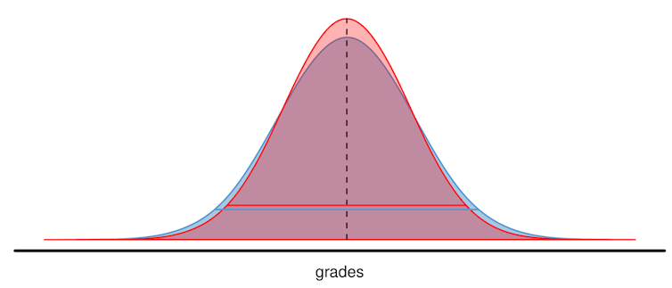
The first was this paper by Rose O'Dea, Malgorzata Lagisz (both UNSW), Michael Jennions (ANU), and Shinichi Nakagawa (UNSW), published in the journal Nature Communications. O'Dea and Nakagawa wrote about the paper in The Conversation late last month. The paper was based on a meta-analysis (an analysis that combined the results from many different studies into a single analysis) of 227 other studies that included over 1.6 million high school students. It tested the 'variability hypothesis' - the idea that male students in STEM (Science, Technology, Engineering, and Maths) subjects show greater variability in performance. That means that there are more male students than female students in each tail of the distribution - more male students than female students do very poorly, and more male students than female students do very well. So, you can think of the distributions of male and female students' grades as something like this:
The blue distribution (males) has a smaller peak and fatter tails than the red distribution (females), so there are more male students at the top of the distribution. Note that the distributions have the same mean, which is not what we would expect, since female students on average tend to do better. O'Dea et al. confirm that result, but also find some support for the variability hypothesis:
Overall, girls had significantly higher grades than boys by 6.3%... with 10.8% less variation among girls than among boys...
Girls’ significant advantage of 7.8% in mean grades in non-STEM was more than double their 3.1% advantage in STEM... Variation in grades among girls was significantly lower than that among boys in every subject type, but the sexes were more similar in STEM than non-STEM subjects...
In other words, girls had higher grades than boys in both STEM and non-STEM subjects, but the difference in the variability in grades was higher for non-STEM, not STEM, subjects. Here's the resulting distributions:


The ratio of female to male students is equal to one (equal numbers of female and male students) in the top 10% of the distribution of STEM grades, and in the top 2% of non-STEM grades. For the top X% of grades below those thresholds, there are more female than male students (and above those thresholds, there are more male than female students).

Essentially, based on these results, female students outperform male students in both STEM and non-STEM, but they outperform male students by more in non-STEM than in STEM. Which makes these results complementary to those of the second article, by Gijsbert Stoet (Leeds Beckett University) and David C. Geary (University of Missouri), published in the journal Psychological Science (gated, but for the moment at least, this link appears to take you directly to the PDF). Stoet and Geary use PISA (Programme for International Student Assessment) data from over 472,000 students from 67 countries, to look at the intra-individual academic strengths of male and female high school students. Basically, for each student they calculated whether the student performs better (or worse) in reading, maths, or science, compared with the other two subject areas, and by how much better (or worse) they did. They then compare those results between male and female students. They found that:
...there were consistent sex differences in intraindividual academic strengths across reading and science. In all countries except for Lebanon and Romania (97% of countries), boys’ intraindividual strength in science was (significantly) larger than that of girls... Further, in all countries, girls’ intraindividual strength in reading was larger than that of boys, while boys’ intraindividual strength in mathematics was larger than that of girls. In other words, the sex differences in intraindividual academic strengths were near universal...
We found that on average (across nations), 24% of girls had science as their strength, 25% of girls had mathematics as their strength, and 51% had reading. The corresponding values for boys were 38% science, 42% mathematics, and 20% reading.
In other words, female students' relative strength was more likely to be in reading, while male students' strength was more likely to be in science or mathematics. They also found that male students were more likely to overestimate their ability in science than female students were.

Alex Tabarrok at Marginal Revolution has the best take on Stoet and Geary's results:
Now consider what happens when students are told. Do what you are good at! Loosely speaking the situation will be something like this: females will say I got As in history and English and B’s in Science and Math, therefore, I should follow my strengthens and specialize in drawing on the same skills as history and English. Boys will say I got B’s in Science and Math and C’s in history and English, therefore, I should follow my strengths and do something involving Science and Math.
Note that this is consistent with the Card and Payne study of Canadian high school students that I disscused [sic] in my post, The Gender Gap in STEM is NOT What You Think. Quoting Card and Payne:
"On average, females have about the same average grades in UP (“University Preparation”, AT) math and sciences courses as males, but higher grades in English/French and other qualifying courses that count toward the top 6 scores that determine their university rankings. This comparative advantage explains a substantial share of the gender difference in the probability of pursing a STEM major, conditional on being STEM ready at the end of high school."
and myself:
"Put (too) simply the only men who are good enough to get into university are men who are good at STEM. Women are good enough to get into non-STEM and STEM fields. Thus, among university students, women dominate in the non-STEM fields and men survive in the STEM fields."
So, even though female students may be better than male students in STEM subjects at school, we may see fewer of them studying those subjects at university (let alone taking them as a career), because female students are also better in non-STEM subjects at school, and they are better by more in non-STEM than in STEM, compared with male students. Economists refer to this as the students following their comparative advantage. Female students have a comparative advantage in non-STEM, and male students have a comparative advantage in STEM subjects. That is different from absolute advantage (which female students appear to have in both subject areas, at least according to O'Dea et al. - the gender differences in average results are not consistently significant in Stoet and Geary). The O'Dea et al. results and the Stoet and Geary results both support this comparative advantage interpretation.

One final result from Stoet and Geary still needs further exploration. They report that:
...the relation between the sex differences in academic strengths and college graduation rates in STEM fields is larger in more gender-equal countries.
That is a surprising result. If we thought that making genders more equal would reduce the gender gap in STEM, we would expect the exact opposite result! Stoet and Geary's proffered explanation for this seems particularly weak:
Countries with the highest gender equality tend to be welfare states (to varying degrees) with a high level of social security for all its citizens; in contrast, the less gender-equal countries have less secure and more difficult living conditions, likely leading to lower levels of life satisfaction...
So, because people feel more secure in countries with better welfare states, which are also the countries with higher gender equality, they are less likely to pursue the high-risk, high-reward jobs in STEM fields, than safer jobs in non-STEM fields. That definitely needs more follow-up research.

Read more:


Monday, 29 August 2016

Why restricting natural gas exports is not a good idea

This week in ECON110 we are covering international trade (and globalisation). The arguments against free trade often focus on the harms to workers (and firms) in import-competing industries - that is, those firms where jobs would be lost by having to compete with lower-cost foreign producers. The counter-argument is that consumers are made better off in these markets by being able to buy the imported products at much lower prices (increasing their consumer surplus).

Much less attention is focused on the impacts of trade restrictions on exporting industries. Consider for example, this 2013 New York Times story about the exporting of natural gas in the U.S.:
As Dow Chemical’s chief executive, Andrew N. Liveris has made himself into something of an outcast among his fellow business leaders.
The reason? He is spearheading a public campaign against increased exports of natural gas, which he sees as a threat to a manufacturing renaissance in the United States, not to mention his own company’s bottom line. But many others say such exports would provide far more benefits to the country than drawbacks, all part of a transformation that promises to increase the nation’s weight in the global economy...
By 2020, new oil and gas production could increase the country’s economic output by 2 to 4 percent beyond what it otherwise would be, add as many as 1.7 million jobs and perhaps reduce the bill for energy imports to zero, according to a report by the McKinsey Global Institute.
“This is a giant turnaround,” said Daniel Yergin, a longtime energy expert and author of a recent book, “The Quest: Energy, Security and the Remaking of the Modern World.” “This is fundamentally improving the competitive position of the United States in the world economy.”
But that windfall is at risk if the government permits natural gas exports to increase quickly, Mr. Liveris warns.
Natural gas is valuable, and on the surface the argument to restrict exports of natural gas in order to keep the value in the U.S. economy makes some intuitive sense. But it would also be quite wrong, and actually make the U.S. worse off.

To see why, let's take a step back and compare an exporting country with trade and without trade. Consider the diagram below, and we'll assume that the U.S. has a comparative advantage in producing natural gas - that means that the domestic price of natural gas (PD) would be below the price of natural gas on the world market (PW). This indicates that U.S. natural gas producers can produce and sell natural gas at a lower cost than foreign producers. Because the domestic price is lower than the world price, if the country is open to trade there are opportunities for traders to buy natural gas in the domestic market (at the price PD), and sell it on the world market (at the price PW) and make a profit (or maybe the suppliers themselves sell directly to the world market for the price PW). In other words, there are incentives to export natural gas. The domestic consumers would end up having to pay the price PW for natural gas as well, since they would be competing with the world price (and who would sell at the lower price PD when they could sell on the world market for PW instead?). At this higher price, the domestic consumers choose to purchase Qd0 natural gas, while the domestic suppliers sell Qs0 natural gas (assuming that the world market could absorb any quantity of natural gas that was produced). The difference (Qs0 - Qd0) is the quantity of natural gas that is exported. Essentially the demand curve with exports follows the red line in the diagram.


We can also use the diagram to demonstrate the gains from trade for an exporting country. Without trade, the market would operate at the domestic equilibrium, with price PD and quantity Q0. Consumer surplus (the gains to domestic natural gas consumers) would be the area AEPD, the producer surplus (the gains to domestic natural gas producers) would be the area PDEF, and total welfare (the sum of consumer surplus and producer surplus, or the gains to society overall) would be the area AEF. With trade, the consumer surplus decreases to ABPW, the producer surplus increases to PWCF, and total welfare increases to ABCF. Since total welfare is larger (by the area BCE), this represents the gains from trade. So, the U.S. is better off with trade, because the total welfare is larger than it is without trade.

Now consider an intermediate case. Instead of having no trade, or having unlimited trade, what would happen if the government allows trade up to some limit? In other words, what happens when there is an export quota? This is demonstrated in the diagram below. Whereas previously, we assumed that the world market could absorb any quantity of exports of natural gas, now the quantity of exports is limited to the agreed quota amount. Let's say that the export quota is limited to the amount between B and G (about half the amount of unrestricted exports). Importantly, the export quota is implemented using licenses - only holders of export licenses are allowed to export natural gas.

Now that there is a quota on exports, consider what happens to the demand curve (including exports). The upper part represents the domestic consumers with high willingness-to-pay for natural gas. Then there is a limited quantity of export demand, at the world price PW. After that, there are still profit opportunities for domestic suppliers (that is, there are still some domestic consumers who are willing to pay more than what it costs the suppliers to produce natural gas). So, the demand curve (including the export quota) pivots at the point G, and follows a parallel path to the original demand curve (i.e. the demand curve including exports follows the red line in the diagram). The domestic price is the price where supply is equal to demand (P1). Export license holders can purchase natural gas at this price, and then sell it on the world market and receive the higher world price (PW), and pocket a profit. The domestic consumers choose to purchase Qd1 natural gas at the price P1, while the domestic suppliers sell Qs1 natural gas at that price. The difference (Qs1 - Qd1) is the quantity of exports (which is also the quantity of the quota).


Now the consumer surplus is larger than it was without the export quota (it is now the area AJP1), the producer surplus is smaller than it was without the export quota (it is now the area P1HF). The export license holders now receive a surplus (profit), equal to the area KLHJ. Total welfare (which is now made up of the consumer surplus, producer surplus, and license holder surplus) is smaller than without the export quota (it is now the area AJHF+KLHJ). There is a deadweight loss (a loss of total welfare arising from the export quota) equal to the area [BKJ + LCH] - these areas were part of total welfare with trade and no export quota, but have now been lost.

Importantly though, note that the total welfare area is larger with the export quota (AJHF+KLHJ) than with no trade at all (AEF). So, the argument that restricting exports of natural gas makes the U.S. better off and will "fundamentally improve the competitive position of the U.S. economy" is simply untrue. Up to the point where the market-determined quantity of natural gas is exported, there are gains to be had from additional exports. That doesn't mean that more exports are always better. For instance, export subsidies that increase exports beyond the quantity shown in the first diagram above are also bad. And, you might want to restrict natural gas production for environmental reasons (which haven't been accounted for in the diagrams above). But those are stories for another day.

Read more:


Tuesday, 1 December 2015

Comparative advantage and trade, Dr Seuss style

Justin Wolfers must have some interesting classes. He just posted this poem in the style of Dr Seuss by one of his students. It covers comparative advantage, task allocation, and trade. My favourite bit:

If tasks were switched amongst our three friends,
Opportunity cost would rise to no end.
Each should focus on that which they do best,
And trade for those products made by the rest.

Nice. It reminds me of this Art Carden effort from a few years ago, "How Economics Saved Christmas", which is an assigned reading in my ECON110 class.


Saturday, 25 April 2015

Why export quotas probably failed to help coffee farmers

Last year, my wife and I both read the same story from Daily Coffee News, entitled "A Brief History of Coffee Price Volatility in the Modern Era (1963-2013)". Probably unsurprisingly given our different disciplinary backgrounds, we had completely different takeaways from the story. On the one hand, you could take away that free market forces are a bad thing, because they led to volatility in the price of coffee on world markets - as the International Coffee Organization is quoted in the article as saying, this "makes it difficult for roasters to control processing costs and affects profit margins for traders and stockholders, making their activities less attractive".

What I took away from the article was how the International Coffee Organization ensured price stability in the period from 1963 to 1989 - by using a system of export quotas in producing countries. My overall comment was "wow, the coffee farmers were probably worse off, but I bet the middlemen were happy". And now I'll explain why (which I've been promising my wife I would do here for some time).

Let's start with an exporting country - a country that has a comparative advantage producing the product (coffee in this case). That means that the country can produce coffee at a lower opportunity cost than other countries. On a supply-and-demand diagram like the one below, it means that the domestic market equilibrium price of coffee (PD) would be below the price of coffee on the world market (PW). Because the domestic price is lower than the world price, if the country is open to trade there are opportunities for traders to buy coffee in the domestic market (at the price PD), and sell it on the world market (at the price PW) and make a profit (or maybe the suppliers themselves sell directly to the world market for the price PW). In other words, there are incentives to export coffee. The domestic consumers would end up having to pay the price PW for coffee as well, since they would be competing with the world price (and who would sell at the lower price PD when they could sell on the world market for PW instead?). At this higher price, the domestic consumers choose to purchase Qd0 coffee, while the domestic suppliers sell Qs0 coffee (assuming that the world market could absorb any quantity of coffee that was produced). The difference (Qs0 - Qd0) is the quantity of coffee that is exported. Essentially the demand curve with exports follows the red line in the diagram.


We can also use the diagram to demonstrate the gains from trade for an exporting country. Without trade, the market would operate at the domestic equilibrium, with price PD and quantity Q0. Consumer surplus (the gains to domestic coffee consumers) would be the area AEPD, the producer surplus (the gains to domestic coffee producers) would be the area PDEF, and total welfare (the sum of consumer surplus and producer surplus, or the gains to society overall) would be the area AEF. With trade, the consumer surplus decreases to ABPW, the producer surplus increases to PWCF, and total welfare increases to ABCF. Since total welfare is larger (by the area BCE), this represents the gains from trade. So, coffee farmers are better off with trade, because the producer surplus is larger than it is without trade.

What happens when there is an export quota? This is demonstrated in the diagram below. Whereas previously, we assumed that the world market could absorb any quantity of exports of coffee, now the quantity of exports is limited to the agreed quota amount. Let's say that the export quota is limited to the amount between B and G (about half the amount of unrestricted exports). Importantly, the export quota is implemented using licenses - only holders of export licenses are allowed to export.

Now that there is a quota on exports, consider what happens to the demand curve (including exports). The upper part represents the domestic consumers with high willingness-to-pay for coffee. Then there is a limited quantity of export demand, at the world price PW. After that, there are still profit opportunities for domestic suppliers (that is, there are still some domestic consumers who are willing to pay more than what it costs the suppliers to produce coffee). So, the demand curve (including the export quota) pivots at the point G, and follows a parallel path to the original demand curve (i.e. the demand curve including exports follows the red line in the diagram). The domestic price is the price where supply is equal to demand (P1). Export license holders can purchase coffee at this price, and then sell it on the world market and receive the higher world price (PW), and pocket a profit. The domestic consumers choose to purchase Qd1 coffee at the price P1, while the domestic suppliers sell Qs1 coffee at that price. The difference (Qs1 - Qd1) is the quantity of exports (which is also the quantity of the quota).


Now the consumer surplus is larger than it was without the export quota (it is now the area AJP1), the producer surplus is smaller than it was without the export quota (it is now the area P1HF). The export license holders now receive a surplus (profit), equal to the area KLHJ. Total welfare (which is now made up of the consumer surplus, producer surplus, and license holder surplus) is smaller than without the export quota (it is now the area AJHF+KLHJ). There is a deadweight loss (a loss of total welfare arising from the export quota) equal to the area [BKJ + LCH] - these areas were part of total welfare with trade and no export quota, but have now been lost.

Of most interest to us though is that the export quotas don't help the coffee farmers - producer surplus has fallen. In contrast, the export license holders (the middle men, who buy coffee from the farmers and sell it on the world market) are made better off by the export quota system.

But wait - what if the export quota system makes world coffee prices higher? That seems a reasonable possibility - if all coffee producing countries are restricting the supply of coffee to the world market, then that should raise prices for all. I'm sure that's what the International Coffee Organization was probably trying to do all along.

The diagram below demonstrates what happens, if the quota is kept the same size as the previous diagram, but the world price increases from PW to PX. The demand curve (including the export quota) now follows the purple path (since the license holders can now sell at the higher price PX instead of PW), but notice that the resulting domestic price is exactly the same (P1). In terms of welfare effects, the resulting consumer surplus and producer surplus are unchanged even though the world price is now higher. The license holder surplus increases to MNHJ.


So, even if the export quota system successfully raises the world price of coffee, it is the middle men who benefit, not the coffee farmers. Which is why, after the coffee export quota system collapsed in 1989, we would expect coffee farmers to have been made better off.

[Update: Fixed missing label in second diagram]