Showing posts with label Constrained optimisation. Show all posts

Saturday, 14 March 2026

Artificial intelligence and the 'age of leisure'

My ECONS101 class covered constrained optimisation last week, and one of the models we looked at was the labour-leisure trade-off for workers. Now artificial intelligence, and in particular generative AI, is likely to have large impacts on the labour-leisure trade-off. As the Financial Times reported last year (paywalled):

The idea that technological progress can enable people to work fewer hours is not outlandish...

But in order to believe a similar trend is going to take hold again, you have to assume three things. First: that AI will deliver a substantial boost to economic productivity...

Second, you have to assume the economic gains will be widely distributed...

Third, you have to believe workers will “cash in” those proceeds in the form of extra leisure, rather than higher income. But will they? In many developed countries, there has been a slowdown in the reduction in working hours in recent decades...

Far from trading income for leisure, it is the people with the highest salaries who tend to work the longest hours.

Will workers trade off higher productivity for more leisure time? Are we about to enter an 'age of leisure'? The constrained optimisation model for the worker (see also this post) can help us clarify the possibilities. In this model, we'll assume that AI increases productivity, and that the increase in productivity is represented by higher wages for workers. [*] The model will then tell us whether workers might respond by consuming more, or less, leisure.

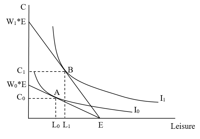
Our model of the worker's decision is outlined in the diagram below. The worker's decision is constrained by the amount of discretionary time available to them. Let's call this their time endowment, E. If they spent every hour of discretionary time on leisure, they would have E hours of leisure, but zero income. That is one end point of the worker's budget constraint, on the x-axis. The x-axis measures leisure time from left to right, but that means that it also measures work time (from right to left, because each one hour less leisure means one hour more of work). The difference between E and the number of leisure hours is the number of work hours. Next, if the worker spent every hour working, they would have zero leisure, but would have an income equal to W0*E (the wage, W0, multiplied by the whole time endowment, E). That is the other end point of the worker's budget constraint, on the y-axis. The worker's budget constraint joins up those two points, and has a slope that is equal to the wage (more correctly, it is equal to -W0, and it is negative because the budget constraint is downward sloping). The slope of the budget constraint represents the opportunity cost of leisure. Every hour the worker spends on leisure, they give up the wage of W0. Now, we represent the worker's preferences over leisure and consumption by indifference curves. The worker is trying to maximise their utility, which means that they are trying to get to the highest possible indifference curve that they can, while remaining within their budget constraint. The highest indifference curve they can reach on our diagram is I0. The worker's optimum is the bundle of leisure and consumption where their highest indifference curve meets the budget constraint. This is the bundle A, which contains leisure of L0 (and work hours equal to [E-L0]), and consumption of C0.

Now, let's say that the situation shown above is the situation before the advent of AI. After AI is introduced, productivity increases, and so wages increase (from W0 to W1). This causes the budget constraint to pivot outwards and become steeper (since the slope of the budget constraint is equal to the wage, the slope has increased from -W0 to -W1). The worker can now reach a higher indifference curve, and it is the position of that higher indifference curve that determines the worker's response in terms of whether they consume more leisure or not. If they move to the higher indifference curve I1, then the worker's new optimum is the bundle of leisure and consumption B, which contains leisure of L1 (and work hours equal to [E-L1]), and consumption of C1. For this worker (whose response is shown in red on the diagram), leisure hours decrease as a result of the higher wage. On the other hand, if they move to the higher indifference curve I2, then the worker's new optimum is the bundle of leisure and consumption C, which contains leisure of L2 (and work hours equal to [E-L2]), and consumption of C2. For this worker (whose response is shown in blue on the diagram), leisure hours increase as a result of the higher wage. [**]

Either of these possibilities could happen. In fact, both could happen, with some workers increasing leisure time and others decreasing leisure time. By itself, this model doesn't answer the question of what will happen, but shows that both increased leisure and decreased leisure are possible outcomes.

The key difference here comes down to the size of the income effect of the increase in wages. When wages increase, the opportunity cost of leisure increases. That makes leisure relatively more expensive, and workers should respond by consuming less leisure. That is what we call the substitution effect - workers substitute away from leisure as it becomes more expensive. However, increased wages also lead to an income effect. Leisure is a normal good, which means that as the worker's income increases, they would like to consume more leisure. Notice that the substitution effect and the income effect are working in opposite directions here. For workers who overall decrease their leisure, the substitution effect (which says they should consume less leisure) must be bigger than the income effect (which says they should consume more leisure). For workers who overall increase their leisure, the reverse is true - the substitution effect must be smaller than the income effect.

AI may lead us into an age of leisure. But only if productivity gains lead to higher wages, and the income effect of higher wages more than offsets the substitution effect.

*****

[*] The assumption that productivity gains will lead to higher wages is a strong assumption. Indeed, the FT article questions whether this assumption is valid. If productivity gains don't lead to higher wages, then this model doesn't help us evaluate whether we're about to move into an 'age of leisure', and the impacts might be more macroeconomic than microeconomic. That is, we may end up with leisure, but arising through weaker labour demand, reduced hours, or unemployment rather than through workers voluntarily choosing more leisure as wages increase.

[**] Notice that the indifference curves I1 and I2 are crossing, and indifference curves cannot cross. However, those two indifference curves are for different workers, so there is no problem. I could easily have drawn two different diagrams, one for each worker, but I've kept them both on the same diagram for efficiency.

Tuesday, 20 January 2026

Why the effects of a guaranteed income on income and employment in Texas and Illinois shouldn't surprise us

The idea of a universal basic income (sometimes called an income guarantee) has gathered a lot of interest over recent years, particularly as fears of job losses to artificial intelligence have risen. The underlying idea is simple. Government makes a regular payment to all citizens (so it's universal) large enough to cover their basic needs (so it's a basic income). However, other than a number of pilot projects, no country has yet fully implemented a universal basic income (UBI), and many have apparently changed their minds after a pilot (see here and here). There are a couple of reasons for that. First, obviously, is the cost. A basic income of just $100 per week for all New Zealanders would cost about $26 billion per year. That would increase the government budget by about 14 percent [*]. And $100 is not a basic income, because no one is going to be able to live on such a paltry amount. Second, there are worries about the incentive effects of a universal basic income. When workers can receive money from the government for doing nothing (because it's universal), will they work less, offsetting some (if not all) of the additional income from the UBI?

That brings me to this NBER working paper by Eva Vivalt (University of Toronto) and co-authors. The paper was originally published back in 2024, and received quite a bit of coverage then (for examples from the media, see here and here), but has been revised since (and I read the September 2025 revision). Vivalt et al. evaluate the impact of two large guaranteed income programmes in north central Texas (including Dallas) and northern Illinois (including Chicago), both of which were implemented by local non-profit organisations (with the programmes funded by OpenResearch, founded by OpenAI CEO Sam Altman). These are not quite UBIs of course, because they weren't available to everyone. Nevertheless, they do help us to understand the incentive effects that could apply to a UBI. Like many would hope a UBI would be (ignoring the immense fiscal cost), the programmes were quite generous (for those in the treatment group, at least) and:

...distributed $1,000 per month for three years to 1,000 low-income individuals randomized into the treatment group. 2,000 participants were randomly assigned to receive $50 per month as the control group.

Vivalt et al. look at the impacts on employment and other related outcomes. There is a huge amount of detail in the paper, so I'm just going to look at some of the highlights. In terms of the overall effect, they find that:

...total individual income excluding the transfers fell by about $1,800 per year relative to the control group, with these effects growing over the course of the study.

So, people receiving the UBI received less income (excluding the UBI - their income increased once you consider the UBI plus their other income). In terms of employment:

The program caused a 3.9 percentage point reduction in the extensive margin of labor supply and a 1-2 hours/week reduction in labor hours for participants. The estimates of the effects of cash on income and labor hours represent an approximately 5-6% decline relative to the control group mean.

People responded to receiving a UBI by working less, just as many of those who had concerns about the incentive effects of a UBI feared. However, the negative incentives also extended to others in the household:

Interestingly, partners and other adults in the household seem to change their labor supply by about as much as participants. For every one dollar received, total household income excluding the transfers fell by around 29 cents, and total individual income fell by around 16 cents.

So, although households received $1000 extra per month from the UBI, their income only increased by $710 on average, because the person receiving the UBI, and other adults in the household, worked less on average. What were they doing with their extra time? Vivalt et al. use American Time Use Survey data, and find that:

Treated participants primarily use the time gained through working less to increase leisure, also increasing time spent on driving or other transportation and finances, though the effects are modest in magnitude. We can reject even small changes in several other specific categories of time use that could be important for gauging the policy effects of an unearned cash transfer, such as time spent on childcare, exercising, searching for a job, or time spent on self improvement.

So, people spend more time on leisure. Do they upgrade to better jobs, which is what some people claim would happen (because the UBI would give people the freedom to spend more time searching for a better job match)? Or do they invest in more education, or start their own business? It appears not, as:

...we find no substantive changes in any dimension of quality of employment and can rule out even small improvements, rejecting improvements in the index of more than 0.022 standard deviations and increases in wages of more than 60 cents. We find that those in the treatment group have more interest in entrepreneurial activities and are willing to take more financial risks, but the coefficient on whether a participant started a business is close to 0 and not statistically significant. Using data from the National Student Clearinghouse on post-secondary education, we see no significant impacts overall but some suggestive evidence that younger individuals may pursue more education as a result of the transfers...

Some people have concluded that the results show that a guaranteed income or UBI is a bad policy. However, the guaranteed income did increase incomes (including transfers) overall and therefore makes people on average better off financially. Leisure time is an important component of our wellbeing, so we shouldn't necessarily consider more leisure time a bad outcome for a policy. In fact, Vivalt et al. also find that on average the guaranteed income increases subjective wellbeing on average (but only in the first year, after which subjective wellbeing returns to baseline). 

The results should have surprised anyone. They are consistent with a simple model of the labour-leisure tradeoff that I cover in my ECONS101 class. The model (of the worker's decision) is outlined in the diagram below. The worker's decision is constrained by the amount of discretionary time available to them. Let's call this their time endowment, E. If they spent every hour of discretionary time on leisure, they would have E hours of leisure, but zero income. That is one end point of the worker's budget constraint, on the x-axis. The x-axis measures leisure time from left to right, but that means that it also measures work time (from right to left, because each one hour less leisure means one hour more of work). The difference between E and the number of leisure hours is the number of work hours. Next, if the worker spent every hour working, they would have zero leisure, but would have an income equal to W0*E (the wage, W0, multiplied by the whole time endowment, E). That is the other end point of the worker's budget constraint, on the y-axis. The worker's budget constraint joins up those two points, and has a slope that is equal to the wage (more correctly, it is equal to -W0, and it is negative because the budget constraint is downward sloping). The slope of the budget constraint represents the opportunity cost of leisure. Every hour the worker spends on leisure, they give up the wage of W0. Now, we represent the worker's preferences over leisure and consumption by indifference curves. The worker is trying to maximise their utility, which means that they are trying to get to the highest possible indifference curve that they can, while remaining within their budget constraint. The highest indifference curve they can reach on our diagram is I0. The worker's optimum is the bundle of leisure and consumption where their highest indifference curve meets the budget constraint. This is the bundle A, which contains leisure of L0 (and work hours equal to [E-L0]), and consumption of C0.

Now, consider what happens when the worker receives a UBI. This is shown in the diagram below. At each level of leisure (and work), their income (and therefore consumption) is higher. That shifts the budget constraint up vertically by the amount of the UBI. If the worker spends no time at all working, they now have consumption of U, instead of zero, and if they spend all of their time working (and have no leisure) their consumption would be W0*E+U. The worker can now reach a higher indifference curve (I1). Their new optimal bundle of leisure and consumption is B, which contains leisure of L1 (and work hours equal to [E-L1]), and consumption of C1. Notice that the worker now consumes more leisure and more consumption as well. Because leisure has increased, that means that the number of work hours has decreased. The increase in leisure, decrease in work hours, and increase in income overall (when the UBI is included), are consistent with what Vivalt et al. found.

So, based on a simple model of the labour-leisure tradeoff, the results of this guaranteed income programme are not surprising. We should have expected a reduction in work, and a reduction in labour income, and that's what Vivalt et al. found. The question policymakers are left with is whether a large income transfer like this is worth it for government, if each $1000 transferred increases incomes by just $710 on average.

[HT: Marginal Revolution, back in 2024]

*****

[*] Of course, if other welfare payments were scrapped in favour of a universal basic income, then the net cost would be lower. Nevertheless, the point that the cost is very high still stands.

Thursday, 18 July 2024

Food price rises and consumer choices

This week my ECONS101 class has been covered constrained optimisation, with a particular focus on consumer choices. So, I was interested to see this article by Puneet Vatsa and Alan Renwick (both Lincoln University) in The Conversation yesterday, talking about food price rises:

The rising price of food has been making headlines for the past decade. But prices have not been rising consistently across all food groups – and this has major health implications for New Zealanders...

Although food price increases have been noticeable over the long term, the change in relative prices — the cost of one food category compared to another — often goes unnoticed. Nevertheless, these relative price changes are crucial as they influence consumer choices, often subconsciously.

Our new research examines Stats NZ data between 2014 and 2023 on the price of 85 food items collected from 560 retail outlets – supermarkets, greengrocers, fish shops, butchers, convenience stores, restaurants, and outlets selling breakfast, lunch, and takeaway foods – in 12 urban areas.

Between July 2014 and March 2023, prices of some sweetened, processed foods and drinks such as boxed chocolate, ice cream, soft drinks and sports energy drinks have risen by around 14%. At the same time, price of some fruits and vegetables have risen by around 45%.

When sweetened processed foods are cheaper relative to fruits and vegetables, people tend to buy more of the former. This can lead to poor dietary habits, increasing the prevalence of obesity and related health issues.

Changes in relative prices are something that we can examine theoretically using the consumer choice model (otherwise known as the constrained optimisation model for the consumer). I've used this model to describe consumer choices before (see here and here), but this application is slightly more difficult, as the price of both goods is changing over time. I'm not going to go into the basics of the model. It has two components - budget constraints (which I explain here) and indifference curves (which I explain in some detail here).

Consider a model of consumer choices, where the consumer can choose between two goods: sweetened processed foods (S) and fruits and vegetables (F). This model is shown in the diagram below. The consumer has income of M, the price of sweetened processed foods is PS0, and the price of fruits and vegetables is PF0. The consumer's budget constraint is shown by the straight, downward sloping line. The slope of the budget constraint is equal to [-PF0/PS0] (which is the relative price of the two goods). The consumer's best affordable choice (the consumer's optimum) is the bundle of goods E0, which is on the highest indifference curve that they can reach, I0. That bundle of goods includes S0 units of sweetened processed foods, and F0 units of fruits and vegetables.

Now consider changes in prices. The price of sweetened processed foods increases (to PS1), and the price of fruits and vegetables increases (to PF1), but the increase in the price of fruits and vegetables increases by more than the increase in the price of sweetened processed foods. The consumer's budget will not be able to buy as much as before (their income is still equal to M [*]), so the budget constraint will move inwards. The budget constraint will also become steeper, because the relative price has changed. The price of both goods has increased, but the price of fruits and vegetables has increased by more than the price of sweetened processed foods. So, the new slope of the budget constraint, which is equal to [-PF1/PS1], must be a larger number (because PF is increasing faster than PS), meaning that the budget constraint is steeper.

This change is shown in the diagram below. The new budget constraint is the red line - it is steeper and moved inwards from the original black budget constraint. The consumer can no longer buy the bundle of goods E0, because it is outside the budget constraint (the consumer cannot afford to buy E0 anymore). The consumer's new best affordable choice is the bundle of goods E1, which is on the highest indifference curve that they can reach now, I1. That bundle of goods includes S0 units of sweetened processed foods, and F0 units of fruits and vegetables.

Notice that the consumer buys less of both goods, but the impact on the quantity of fruits and vegetables is greater than the impact on the quantity of sweetened processed foods, which is what Vatsa and Renwick found in their research. [**]

*****

[*] To make life a bit easier, we're assuming that the consumer's income has not changed. Effectively, this reflects an assumption that the price of both goods is increasing faster than incomes have increased, which is probably not too far from recent experience in New Zealand, where food price inflation has been higher than wage inflation.

[**] It is also possible to draw this diagram in such a way that the impact on the quantity of fruits and vegetables is less than the impact on the quantity of sweetened processed foods. The only difference in the diagram would be the placement of the new highest indifference curve I1 and the new best affordable choice E1, which would be further to the right on the diagram. I'll leave that as an exercise for any interested reader to do for themselves.

Tuesday, 8 August 2023

Carbon taxes are not a costless way to boost the economy

Economists recognise that any choice we make comes with an opportunity cost - for every thing that we choose to do, we are giving up the opportunity of doing something else. This is memorably captured in the acronym TANSTAAFL - There Ain't No Such Thing As A Free Lunch. So, I was interested to read  this article in The Conversation last week, by Mona Mashhadi Rajabi (University of Technology Sydney), about carbon taxes:

A new study has found that a carbon tax, accompanied by “revenue recycling”, can produce both environmental and economic benefits for Australia.

Revenue recycling means money reaped from a carbon tax would be redirected back into the economy. This means the money accumulated from the tax would be redistributed between different stakeholders in the economy without increasing the government’s revenue.

To be more specific, the tax income should be used to support consumption, invest in new research and development projects, and subsidise energy saving and pollution reducing programs. Using this approach makes the tax more politically appealing to companies and other opponents.

So far, so good. But this bit is more than a little surprising:

My study recommends that in the first year, all the tax revenue would be used to support consumption. However, the amount of money allotted to investment would rise from the second year as the carbon tax rate increases. It is estimated that about $57 billion would be available for new technologies over 13 years under this carbon tax.

Imposing a carbon tax would also provide a financial incentive for industry to reduce its fossil fuel use. It would motivate the sector to shift to low-carbon technologies as they would bear a smaller tax bill and reap larger profits.

My study concludes Australia could reduce carbon emissions by 35% while GDP would increase by 0.286% by 2035 and new jobs would be created in research and development. Following the recommended carbon tax design, Australia’s transition to a low-carbon economy would be accelerated, which would benefit both the economy and the environment.

This appears to describe a policy choice with no trade-off. That is, there is no opportunity cost. If the government can tax carbon, pump that money back into the economy to support consumption, and increase consumption and output (GDP), then someone ought to be shouting this from the rooftops. Rajabi is describing a route to infinite consumption. Because, having increased consumption and GDP, the government can then raise taxes again, increasing consumption and GDP by more, and then raise taxes again, increasing consumption and GDP by even more. Repeat this process over and over again, all the way to infinite GDP. Of course, that makes no sense.

To see why, let's consider what happens when you tax a product, and give all of the tax revenue back to consumers as additional income. We'll start with the basic consumer choice model (or the constrained optimisation model of the consumer), as shown in the diagram below. We are using some made up numbers, but the example works the same with other combinations of numbers. The diagram shows the budget constraint for a consumer with income of $1000, choosing between buying carbon goods (with a price of $1), or all other goods (AOG, also with a price of $1). The consumer can choose to consume anywhere on their budget constraint or below it (this is the feasible set). The budget constraint runs from a bundle of goods with no carbon goods at all, and the consumer spending all of their income to buy 1000 AOG, to a bundle of goods with no AOG at all, and the consumer spending all of their income to buy 1000 carbon goods. The slope of the budget constraint is equal to the relative price of the goods (the price of carbon goods, divided by the price of AOG), which is equal to 1 ($1/$1). The consumer is trying to get to the highest possible indifference curve, which is the indifference curve I0 (for more on indifference curves, read this post). They buy the bundle of goods E0, which contains 500 of AOG (costing $500) and 500 carbon goods (costing $500).

Now consider what happens when carbon goods are taxed. Let's assume that the tax is so high that it doubles the price of carbon goods [*]. The effect of this change is shown in the diagram below. The consumer's budget constraint pivots inwards to the red line, and becomes steeper. The slope of the budget constraint is now equal to 2, which is the new relative price of the goods (the price of carbon goods, divided by the price of AOG, which is now $2/$1). If the consumer were only buying AOG (and no carbon goods), they could still buy 1000 AOG. However, if they were only buying carbon goods (and no AOG), they could now only buy 500 AOG. The consumer can no longer afford the bundle E0 - it is outside the feasible set (outside the budget constraint). Instead, the consumer will consume the bundle of goods on the highest indifference curve that they can reach on the new budget constraint. That is the bundle E2, which is on the indifference curve I2, and contains 600 of AOG (costing $600), and 200 carbon goods (costing $400). Notice that the consumer is still spending all of their income, but they have been made much worse off (they are now on a lower indifference curve, meaning that they get less utility from their consumption).

Now let's see what happens if we recycle the tax revenue back to the consumer. The budget constraint remains steep (because the relative price of carbon goods and AOG is still equal to 2), but moves outwards parallel to the previous budget constraint. It doesn't move out all the way to E0 though. At E2, the consumer was paying $200 in carbon tax, so their income goes up by $200, to $1200. The new budget constraint, shown in blue, extends from the point where they spend all $1200 on AOG, buying 1200 AOG, to the point where they spend all $1200 on carbon goods, buying 600 carbon goods. The consumer can now do better than the bundle of goods E2, and reach a higher indifference curve I1, by buying the bundle of goods E1. That bundle contains 700 AOG (costing $700), and 250 carbon goods (costing $500). However, notice that even after the tax revenue has been recycled to them, the consumer is not as well off as they were before the tax was introduced. They may be spending more ($1200 instead of $1000), but their utility is lower.

This demonstrates that there is a cost to this policy. The consumer pays it in the form of lower utility. To be fair, in a sense Rajabi is correct. The consumer is now spending more than before ($1200 instead of $1000), so consumption has increased. But that is an increase in nominal terms. The price of carbon goods has gone up. If we think about the value of the goods that the consumer is buying, at the original (non-taxed) prices, they are only buying $950 worth of goods now (700 AOG worth $700 and 250 carbon goods worth $250), compared with $1000 before the tax was introduced. Or if we think about the value of the goods that the consumer was buying before the tax was introduced, but valued at the new prices, they were previously buying $1500 worth of goods (500 AOG worth $500 and 500 carbon goods worth $1000), but now they are buying $1200 worth. Either way, they are now buying a total bundle of goods that is worth less - the consumer's real income has decreased.

Of course, most people who advocate for 'revenue recycling' are not arguing that every taxpayer would receive back exactly what they paid in the tax. Many prefer that the 'carbon dividend' would be paid only to low income households. That would change the analysis somewhat. First, there would be high-income households for which the analysis looks much like the second diagram - a carbon tax with no offsetting dividend. These households would be unambiguously worse off with the tax. Second, there would be low-income households for which the analysis looks like the third diagram, but with the increase in income from the revenue recycling being much larger. In theory, these low-income households would be better off as a result of the carbon dividend. In other words, the tax would redistribute income from high-income taxpayers to low-income taxpayers. However, it still wouldn't increase the real value of consumption or GDP overall. It would simply redistribute who is doing the consumption spending.

Overall, we can conclude that it isn't possible to simply pump up the economy endlessly by taxing carbon goods and recycling the tax revenue to consumers as additional income. Any analysis that shows this is possible is clearly missing something important. There ain't no such thing as a free lunch.

*****

[*] In reality, this would require a tax of more than 100 percent, because a tax raises the price that consumers pay, but producers share the burden of the tax, so the whole tax amount is not passed onto consumers as a higher price. For more on this, see this post. However, for simplicity we will assume that the entire tax is passed onto the consumer in the form of a higher price. This assumption would affect the exact numbers from the example, but not the overall conclusion.

Sunday, 23 July 2023

Why indifference curves don't cross

This post follows up on the previous two (see here and here), by explaining why indifference curves don't cross each other. As noted in those earlier posts, indifference curves are the way that we represent the decision-maker's preferences in the constrained optimisation model. An indifference curve connects all of the bundles of goods that provide the decision-maker with the same amount of utility (satisfaction, or happiness).

We'll stick with using the consumer choice model as our illustrative model, and show what happens when indifference curves cross, as shown in the diagram below. The indifference curve I1 represents some higher level of utility than the indifference curve I1. So, the bundle of goods C is better than Bundle A, because it lies on a higher indifference curve - Bundle C provides the consumer with more utility than Bundle A. Bundle C is also clearly better than Bundle A because Bundle C has the same amount of Good X, but more of Good Y. And, as we assumed earlier, more is always better than less.

The problem comes in when we compare Bundle A and Bundle C with Bundle B. Bundle A and Bundle B are just as good as each other. They are both on the indifference curve I0, so they must provide the consumer with the same amount of utility. Bundle B and Bundle C are just as good as each other. They are both on the indifference curve I1, so they must provide the consumer with the same amount of utility.

So, to summarise, Bundle A is just as good as Bundle B (same utility), and Bundle B is just as good as Bundle C (same utility). That means that Bundle A must be just as Good as Bundle C. And yet, we started this example by saying that Bundle C is clearly better than Bundle A. Clearly this makes no sense. Bundle A and Bundle C cannot simultaneously provide the same utility when Bundle C is better than Bundle A.

That is because when indifference curves cross, it violates the mathematical property of transitivity. I prefer to say that it simply makes no sense. So, while indifference curves need not necessarily be parallel, they certainly can't cross each other.

Read more:

Saturday, 22 July 2023

Why indifference curves are curves (and when they are not)

Yesterday's post outlined how to construct an indifference curve. I left the question of why indifference curves are curves, and not straight lines, unanswered. So, I want to cover that off in this post.

As I noted in yesterday's post, indifference curves are the way that we represent the decision-maker's preferences in the constrained optimisation model. We'll stick with using the consumer choice model as our illustrative model. For the consumer, an indifference curve connects all of the bundles of goods that provide the consumer with the same amount of utility (satisfaction, or happiness).

To understand why indifference curves are curves, we first need to recognise that consumers' choices are subject to diminishing marginal utility. Marginal utility is the additional utility that the consumer receives from consuming one more unit of the good. Marginal utility decreases as the consumer consumes more of a good because of satiation (which, taken literally, means that the consumer gets full as they eat more). Consider the example of a consumer that is hungry and has a pizza in front of them. They eat a slice. It gives them some marginal utility (satisfaction). They eat another slice. The second slice gives them some more marginal utility, but not as much as the first slice (because they aren't as hungry anymore). They eat another slice. The third slice gives them some more marginal utility, but not as much as the first or second slice. And so on.

Now, how does that relate to the indifference curve? The slope of the indifference curve is known as the marginal rate of substitution. It is the quantity of one good (Good Y) that the consumer is willing to give up to get one more unit of the other good (Good X), and be just as satisfied (they would have the same utility afterwards). This marginal rate of substitution (MRS) is equal to the ratio of the marginal utilities, [-MUX/MUY], for reasons that I won't go into here (because it requires calculus - but if you are interested, scroll down towards the end of this blog post). The MRS is a negative number, because the indifference curve is downward sloping.

It turns out that it is diminishing marginal utility that leads the indifference curve to be a curve. Consider the indifference curve I0 shown in the diagram below. At the top of the curve, at Bundle A, the consumer has not much of Good X, but lots of Good Y. The marginal utility of Good X will be high (because the consumer doesn't have much, and diminishing marginal utility means that the marginal utility will be high when the consumer doesn't have much of a good). The marginal utility of Good Y will be low (because the consumer has a lot, and diminishing marginal utility means that the marginal utility will be low when the consumer has a lot of a good). So, the ratio [-MUX/MUY] will be a big number in absolute terms (because we are dividing a big number by a small number). The marginal rate of substitution is high, which means that the slope of the indifference curve is steep.

At the bottom of the curve, at Bundle B, the consumer has lots of Good X, but not much of Good Y. The marginal utility of Good X will be low (as explained above, but in reverse). The marginal utility of Good Y will be high. So, the ratio [-MUX/MUY] will be a small number in absolute terms (because we are dividing a small number by a big number). The marginal rate of substitution is low, which means that the slope of the indifference curve is flat.

Now think about moving along the indifference curve. It is a curve, and not a straight line, because as we move along the indifference curve, the marginal utility of Good X decreases, and the marginal utility of Good Y increases. So, the ratio [-MUX/MUY] becomes a smaller number (in absolute terms), which means that the marginal rate of substitution is smaller, and the indifference curve must therefore be a bit flatter. We start at bundles of goods (like Bundle A) where the indifference curve is steep, and end at bundles of goods (like Bundle B) where the indifference curve is flat.

However, having established that diminishing marginal utility leads the indifference curve to be a curve and not a straight line, it turns out that the indifference curve is not always a curve. There are some special cases. One special case is perfect substitutes (which I have blogged about before here). Perfect substitutes are goods that, in the eyes of the consumer, are identical. The consumer is indifferent between them. One example is red M&Ms and blue M&Ms. When goods are perfect substitutes, the indifference curves are straight lines, as shown in the diagram below for red M&Ms and blue M&Ms. That's because, for every red M&M the consumer gives up, they would be willing to accept one blue M&M and remain just as satisfied (same utility). In other words, the marginal rate of substitution is constant (and equal to one, in this case). Because the marginal rate of substitution is constant, the indifference curve must always have the same slope, so it is a straight line.

Another special case is perfect complements. Perfect complements are goods that must be consumed together, in a specific ratio. One example is left shoes and right shoes. If the consumer has one pair of shoes, and is given more left shoes, their utility remains the same - they are no better off, because they still only have one pair of shoes. Similarly, if they are given more right shoes, their utility remains the same, because they still only have one pair of shoes. That leads to indifference curves that are right angles, as shown in the diagram below. The consumer's utility is determined by the number of complete pairs of shoes that they have.

Perfect substitutes and perfect complements are opposite extremes of what indifference curves may look like. In most cases, indifference curves are somewhere between the two extremes. And, if you think about it, in-between a right angle and a straight line is a curve, which is how we usually draw indifference curves.

Read more:

Friday, 21 July 2023

Constructing an indifference curve

When I was writing my previous post that applied the consumer choice model (otherwise known as the constrained optimisation model for the consumer), I noticed that in this earlier post applying the same model, I had promised a more detailed discussion of indifference curves. Some sixteen months on, it must be time for me to make good on that promise. So, here's the explanation that I have developed over a number of years, that I use to explain indifference curves in my ECONS101 class.

We'll start by limiting ourselves to one application of the constrained optimisation model - the model for consumer choices. Next, we need some assumptions. We'll assume that the goal of the consumer is to maximise their utility (their satisfaction, or happiness). We'll also assume that the consumer is only buying two goods, Good X and Good Y. And finally, we'll assume that more of each good is always better than less (so, having more of a good will always increase the utility of the consumer). [*]

We can represent the possible bundles of goods that the consumer might choose to consume in a diagram, as shown below. Consider one bundle of goods roughly in the centre of the diagram, Bundle B, which includes XB of Good X, and YB of Good Y.

Now, let's compare Bundle B with other bundles of goods that the consumer might choose. That is shown in the diagram below, by separating the diagram into four quadrants using dotted lines. Now, think about the comparison of Bundle B with bundles in those other quadrants. All of the bundles of goods that lie in the grey shaded quadrant up and to the right of Bundle B must be better than Bundle B (in the sense that they provide the consumer with more utility). That's because those bundles of goods either contain more of Good X, more of Good Y, or more of both goods. And more is always better (higher utility) than less. Next, all of the bundles of goods that lie in the grey shaded quadrant down and to the left of Bundle B must be worse than Bundle B (in the sense that they provide the consumer with less utility). That's because those bundles of goods either contain less of Good X, more of Good Y, or less of both goods. And because more is always better, less is always worse.

What about the other two quadrants? The bundles of goods in those quadrants are not obviously always better, or worse, than Bundle B. To get our head around those, let's draw a big circle around Bundle B, as shown in the next diagram below. Now, think about what happens in the comparison of bundles of goods, as we move anticlockwise around the circle, starting with Bundle D. Bundle D must be better than Bundle B (because Bundle D has more of Good X than Bundle B). That is also true of every bundle of goods as we move around the circle to Bundle E, which is also better than Bundle B (because Bundle E has more of Good Y than Bundle B). Then, we continue around the circle to Bundle F, which is worse than Bundle B (because Bundle F has less of Good X than Bundle B). Somewhere along the way between Bundle E and Bundle F, we moved from bundles of goods that are better than Bundle B to bundles of goods that are worse than Bundle B. So, somewhere along that part of the circle is a bundle of goods that is just as good as Bundle B (because it provides exactly the same amount of utility to the consumer as Bundle B does). Let's say that bundle is Bundle A.

Now, let's go back to our circle. Bundle F was worse than Bundle B. That is also true of every bundle of goods as we move around the circle to Bundle G, which is also worse than Bundle B (because Bundle G has less of Good Y than Bundle B). Then, we continue around the circle to and back to the start at Bundle D, which we recall is better than Bundle B. Somewhere along the way between Bundle G and Bundle D, we moved from bundles of goods that are worse than Bundle B to bundles of goods that are better than Bundle B. So, somewhere along that part of the circle is another bundle of goods that is just as good as Bundle B (because it provides exactly the same amount of utility to the consumer as Bundle B does). Let's say that bundle is Bundle C.

Now, we could repeat this exercise for other circles that are larger, or smaller, than the circle we drew above. And in every case, we would find that there are two bundles of goods on each of our new circles that are just as good as Bundle B - one bundle in the top left quadrant, and one bundle in the bottom right quadrant. If we then draw a curve that joins up all of those bundles of goods that are just as good as Bundle B (because they provide exactly the same amount of utility to the consumer as Bundle B does), we would have a curve that we call the indifference curve. That is shown in the diagram below, and is labelled I0.

It's called an indifference curve because the consumer is indifferent between any of the bundles of goods on that curve, because all of the bundles of goods on the curve provide the consumer with exactly the same amount of utility). If we gave the consumer the choice between Bundle A and Bundle B, they wouldn't care which one they were given - they are indifferent between those two options. Similarly, if we gave the consumer the choice between Bundle B and Bundle C, they would be indifferent. And if we gave the consumer the choice between Bundle A and Bundle C, they would be indifferent. And the same for any other bundle of goods on that indifference curve I0.

So, now you can see where we get indifference curves from. They are a necessary feature of all constrained optimisation models, not just the constrained optimisation model for the consumer. For example, in my ECONS101 class, we also briefly look at the constrained optimisation model of the worker, and the constrained optimisation model of the saver, and both of those feature indifference curves as well. Now, you may be wondering why we draw indifference curves as curves, rather than straight lines. I'll address that point in my next post.

*****

[*] If this assumption didn't hold, and having more of a good made a consumer worse off, it wouldn't be a good, it would be a bad. We can draw indifference curves for bads. The same principles apply, it's just that higher utility is not up and to the right anymore.

Wednesday, 19 July 2023

Fuel price increases revisited, and the Law of Demand

Last week, I posted about the incentive effects of a fuel price change, noting that:

When the price of petrol went up on 1 July this year, it created an incentive for people to consume less petrol.

Now that I've covered the consumer choice model (or the constrained optimisation model for the consumer) in my ECONS101 class, it's time to revisit what happens when the price of fuel goes up, from the perspective of a fuel consumer. I'm not going to go through the basics of the consumer choice model here though, as I did that in this post about kÅ«mara prices last year, so refer to that for the basic setup of the model.

The consumer choice model for the fuel consumer is shown below. The consumer can choose to buy a bundle of goods that includes some quantity of fuel (measured along the x-axis) and some quantity of 'all other goods' (AOG; measured along the y-axis). The starting point for our consumer is shown in black. The straight line that runs from M/Pa to M/Px0 is the consumer's budget constraint when the price of fuel is low (Px0). The consumer is trying to get to the highest possible indifference curve, which is the indifference curve I0. The consumer buys the bundle of goods E0, which contains X0 fuel.

Once the price of fuel goes up (to Px1), the budget constraint pivots inwards (shown by the red budget constraint, which runs from M/Pa to M/Px1). The consumer can no longer buy the bundle of goods E0, because it lies outside the consumer's budget constraint (it is outside the consumer's feasible set). Now, the highest possible indifference curve that the consumer can reach is the red indifference curve I1. The consumer buys the bundle of goods E1, which contains X1 fuel.

So, this model shows that when the price of fuel increases (from Px0 to Px1), the consumer decreases the amount of fuel that they buy (from X0 to X1). That is the Law of Demand, which is one of the most robust findings in economics. And it is clear that the consumer choice model demonstrates the same incentive effect of the fuel price increase that I discussed in my post about fuel prices last week.

Read more:

Sunday, 5 March 2023

Kūmara prices, consumer decision-making, and the Law of Demand

Yesterday I posted about kūmara prices increasing, and the impact of that on the markets for kūmara and potatoes. This week, my ECONS101 class will be covering constrained optimisation, and the main application of the general constrained optimisation model that we will be looking at is the consumer choice model. So, it seems timely to look at the effect of kūmara prices on consumer decision-making, using that model.

Consider the decision-making of a single consumer. [*] The model is shown in the diagram below. The consumer can choose to buy kÅ«mara (measured along the x-axis) or 'all other goods' (AOG; measured along the y-axis). All of the points within the space on the diagram are combinations of kÅ«mara and AOG, which we will refer to as bundles of goods. Now, the consumer's choice of how much of each good (kÅ«mara and AOG) they will buy is constrained by their income (M). This is represented on the diagram by the straight-line budget constraint. The budget constraint starts at a bundle of goods with only AOG and no kÅ«mara at all. At that point (at the top of the budget constraint), the consumer is spending all of their income on AOG, and nothing on kÅ«mara. The maximum amount of AOG the consumer can buy is M/Pa (where Pa is the price of AOG). At the other end of the budget constraint is a bundle of goods with only kÅ«mara and no AOG at all. At that point (at the bottom of the budget constraint), the consumer is spending all of their income on kÅ«mara, and nothing on AOG. The maximum amount of kÅ«mara the consumer can buy is M/Pk0 (where Pk0 is the price of kÅ«mara). Now, the consumer can afford any bundle of goods (kÅ«mara and AOG) that is on the budget constraint or underneath it (we refer to this as the feasible set). Now, for reasons we won't go into here, the slope of the budget constraint is equal to -Pk0/Pa (the relative price of the two goods). Any bundles of goods outside of the budget constraint cost too much for the consumer to afford. Next, we assume that the consumer is trying to maximise their utility. We represent utility on the diagram using indifference curves. So, the consumer is trying to get to the highest possible indifference curve, while choosing a bundle of goods that is in the feasible set. That happens at the bundle of goods E0, which is on the highest indifference curve I0, and which includes K0 of kÅ«mara and A0 of AOG. The consumer can't get to any higher indifference curve than I0, because any higher indifference curve than I0 wouldn't be touching the budget constraint (and so there would be no bundles of goods on the higher indifference curve that are within the feasible set). That is the basic setup of the consumer choice model, and it shows what the consumer will buy given their income (M), the prices of the goods (Pk0 and Pa), and the consumer's preferences for the two goods (shown by the indifference curves).

Now, consider what happens when the price of kÅ«mara increases (as discussed in yesterday's post) from Pk0 to Pk1. The budget constraint is affected first. If the consumer was only buying AOG and no kÅ«mara at all, then the change in the price of kÅ«mara would not affect them. The point at the top of the budget constraint remains the same. However, if the consumer were only buying kÅ«mara (and no AOG at all), then they would now be able to buy less kÅ«mara. This is represented by the new point M/Pk1, which is a smaller quantity of kÅ«mara than M/Pk0. The budget constraint pivots inwards and becomes steeper. The steeper budget constraint makes sense, because its slope is now equal to -Pk1/Pa, which is a larger number (in absolute terms) than -Pk0/Pa (and larger numbers mean steeper slopes). The problem for the consumer is that they now can't afford the bundle of goods E0, because it is outside of the new feasible set (it is outside the budget constraint - the consumer can't afford to buy E0 any more). Instead, the consumer will choose the bundle of goods on the highest indifference curve that they can now reach. That is the indifference curve I1, and they will buy the bundle of goods E1, which includes K1 of kÅ«mara and A1 of AOG.

In the consumer choice model, after the price of kūmara increases, the new bundle of goods that the consumer chooses to buy contains less kūmara. So, consumers will respond to the increase in the price of kūmara by buying less kūmara. This is what economists refer to as the Law of Demand, one of the most important empirical regularities in economics.

*****

[*] I haven't explained all of the moving parts of the consumer choice model here. In particular, I'm leaving a detailed discussion of indifference curves for a future post. However, if you need a bit more detail, try this explainer.

Saturday, 30 July 2022

How increased wages over the last century reduced the incentive to work

In my ECONS101 class this week, I had to rush through the last bit of the lecture. So, I thought it might be handy to outline the last example we were working on in a bit more detail. It relates to the stylised facts outlined in the figure below, which comes from Unit 3 of The Economy (the textbook we use in ECONS101), but the original data comes from Robert Fogel's book The Fourth Great Awakening and the Future of Egalitarianism.

The figure shows the estimated lifetime hours of discretionary time (24 hours per day, minus the time spent sleeping, eating, and on personal hygiene) in blue, and breaks discretionary hours down into lifetime work hours (in red) and lifetime leisure hours (in green), for 1880, 1995, and a projection for 2040. The interesting thing here (aside from the increase in discretionary hours over time), is the big increase in leisure hours between 1880 and 1995, and reduction in work hours. That change in leisure and work happened in spite of a substantial increase in real wages over the same period.

These facts should come as a little bit of a surprise. That's because we expect that, when wages are higher, people should be working more, not less. In other words, we expect the supply of labour to be upward sloping. The reason we expect people to work more is because, as wages rise, the opportunity cost of leisure increases - every hour spent in leisure means that the worker gives up more income than before. When the opportunity cost of doing something increases, we expect people to do less of it. But in this case, as the opportunity cost of leisure has increased, workers are consuming more leisure, not less.

To understand and explain this puzzle, we need a model. In this case, it is a model of the work decision of workers. In the work decision, the worker is asked to trade off between two goods: leisure, and consumption (or income). The worker wants more leisure, but for every hour of leisure, they give up an hour of working, which means their income (and consumption) will be lower. If the worker wants higher income, they have to give up an hour of leisure.

Our model of the worker's decision is outlined in the diagram below. The worker's decision is constrained by the amount of discretionary time available to them. Let's call this their time endowment, E. If they spent every hour of discretionary time on leisure, they would have E hours of leisure, but zero income. That is one end point of the worker's budget constraint, on the x-axis. The x-axis measures leisure time from left to right, but that means that it also measures work time (from right to left, because each one hour less leisure means one hour more of work). The difference between E and the number of leisure hours is the number of work hours. Next, if the worker spent every hour working, they would have zero leisure, but would have an income equal to W0*E (the wage, W0, multiplied by the whole time endowment, E). That is the other end point of the worker's budget constraint, on the y-axis. The worker's budget constraint joins up those two points, and has a slope that is equal to the wage (more correctly, it is equal to -W0, and it is negative because the budget constraint is downward sloping). The slope of the budget constraint represents the opportunity cost of leisure. Every hour the worker spends on leisure, they give up the wage of W0. Now, we represent the worker's preferences over leisure and consumption by indifference curves. The worker is trying to maximise their utility, which means that they are trying to get to the highest possible indifference curve that they can, while remaining within their budget constraint. The highest indifference curve they can reach on our diagram is I0. The worker's optimum is the bundle of leisure and consumption where their highest indifference curve meets the budget constraint. This is the bundle A, which contains leisure of L0 (and work hours equal to [E-L0]), and consumption of C0.

Now, consider what happens when the wage increases. Real wages (adjusted for inflation) increased a lot between 1880 and 1995. This is shown in the diagram below. For simplicity, let's assume that the worker's time endowment remained the same [*]. As the wage increases, the worker's budget constraint pivots outwards and becomes steeper. It has the same intercept on the y-axis x-axis (equal to the time endowment E), but if the worker spent every discretionary hour working, they would now have consumption (and income) equal to W1*E, where W1 is the new (higher) wage. Notice that the new budget constraint is steeper. This is because the slope of the budget constraint is equal to the wage, and the wage is now higher (and a higher value for the slope means a steeper line). The worker can now reach a higher indifference curve (I1). Their new optimal bundle of leisure and consumption is B, which contains leisure of L1 (and work hours equal to [E-L1]), and consumption of C1. Notice that the worker now consumes more leisure and more consumption as well. Because leisure has increased, that means that the number of work hours has decreased.

Coming back to the key facts we started this post with, the model does clearly show that, when wages go up, the worker will consume more leisure (and work less). Where did our original intuition go wrong?

Our original explanation, that as the wage increases the opportunity cost of leisure increases, and the worker will choose to work less, is the substitution effect of the change in the wage. However, when the relative price of two goods changes, the substitution effect is not the only thing that affects constrained decisions. There is also an income effect. In this case, the income effect says that, when wages go up, the worker can afford more consumption, but can also afford more leisure. Since both leisure and consumption are normal goods (we demand more as our income increases), the worker will want more leisure (and will want to work less). Over the period from 1880 to 1995, the income effect must have been larger than the substitution effect, and has driven the decrease in work hours (and increase in leisure hours).

Does this mean that increasing wages will always induce workers to work less? Of course not. The increase in real wages over the period from 1880 to 1995 was huge. And, no individual worker working in 1880 was still working in 1995, so no worker actually experienced the change we represented in our model. Most wage changes are much more modest, and it does appear that labour supply curves are generally upward sloping at the level of wages we observe over the short run. What that means is that the income effect is likely to be much smaller than what our diagram shows (and that would mean that L1 would be slightly to the left of L0. I'll leave drawing that situation as an exercise for you.

*****

[*] We know this isn't true, but it helps to make this assumption because we are more interested in the effect of the change in wages, and not the effect of the change in time endowment.

Thursday, 30 August 2018

Ontario follows Finland's lead in dropping its universal basic income pilot

Back in May, I wrote a post about Finland cancelling its universal basic income experiment. However, I totally missed the news earlier this month that Ontario was also cancelling its basic income pilot (a point that was raised in one of the presentations in the basic income session at the European Regional Science Association congress, where I am this week). As reported in Business Insider:
Anger and outrage, shock and betrayal: Those were some of the raw emotions after one of the world's largest basic-income experiments was suddenly canceled.
Earlier this week, Doug Ford, the conservative new premier of Ontario, Canada, pulled the rug out from under the experiment, which provided 4,000 people living at or near the poverty line with a stipend.
Ford's government hasn't publicly said much about its reasoning for canceling the program, other than claiming it disincentivizes recipients from finding work...
It lasted only one year, despite Ford's campaign promise to keep the pilot project funded...
"When you're encouraging people to accept money without strings attached, it really doesn't send the message that I think our ministry and our government wants to send," Lisa Macleod, Ontario's minister of children, community, and social services, told reporters this week. "We want to get people back on track and be productive members of society where that's possible." 
This is very similar to the argument behind the cancelling of Finland's basic income experiment, as I noted back in May. Why does a basic income create a disincentive for low-income work? Consider the model of the worker's decision in the diagram below. The worker has limited time (E) that they can allocate to work (and earn income, for consumption, measured on the y-axis) and leisure (measured on the x-axis). The straight line constraint represents the trade-off between consumption and leisure, and has a slope equal to the wage (actually, -w, because it is downward sloping). The highest possible indifference curve the worker can get to is I0, and the optimal bundle of consumption and leisure is E0 (which includes C0 consumption, and L0 leisure (and E-L0 work)).


What happens when you introduce a universal basic income? Since the worker doesn't need to spend time working in order to claim the universal basic income, this simply shifts the constraint upwards by the amount of the basic income (U). The worker can now reach a higher indifference curve (I1), and their optimal bundle of consumption and leisure is now E1, which includes both more consumption (C1) and more leisure (L1). More leisure means less time spent working (because (E-L1) is smaller than (E-L0)). The introduction of the universal basic income decreases work incentives. This might manifest at the extensive margin (some people who were previously working for a low wage decide to stop working entirely), or at the intensive margin (some people choose to work a little bit less).

Would a basic income increase work incentives? It seems unlikely, unless leisure has suddenly become an inferior good (a good that people prefer to consume less of when their income increases).

Could a basic income remove barriers to work? Perhaps if there are credit constraints to obtaining work, as the Business Insider article notes:
"It is kind of hard to find a job when you are struggling for food and you don't have money to keep your phone active and it goes down out of service," she said. "You can't afford to buy job clothing. You can't even do laundry to wash job-interview clothing."
On a basic income, Baltzer could eat healthier, buy clothes, go to the gym, do laundry, and afford phone and internet service to communicate with potential employers, she said.
However, credit constraints are unlikely to be binding for all non-workers, and it is entirely consistent for a basic income to both remove barriers to work for some people and reduce work incentives for other people. The proponents and critics of basic income are simply talking past each other.

A universal basic income remains a promising idea that is very difficult to implement politically. Ultimately, it is only realistic if taxpayers (and politicians) can make peace with the work disincentives that it will generate.

Saturday, 18 August 2018

Television viewing vs. sex

Consider two goods (A and B) that are substitutes - consumers tend to switch consumption towards the good that has become relatively cheaper when the relative price between the two goods changes. So, if the price of A falls, consumers will tend to buy more of A, and less of B. And if the price of A rises, consumers will tend to buy less of A, and more of B.

We can extend the idea of the relative price to consider the full cost of obtaining each good. So, if A becomes more difficult to find, the full cost of consuming A rises, and consumers will buy less of A, and more of B. And so on. Now consider two specific goods: television viewing and sex. Based on the basic model we just outlined, if the full cost of television viewing falls, then consumers will watch more television, and have less sex.

We can also illustrate this using the diagram below. Let's assume that the 'consumer' doesn't own a television. The 'consumer' has a choice of two goods: television viewing (on the x-axis) and sex (on the y-axis). They have limited time (say 20 hours per week), that they can spend on either activity, and this constraint is represented by the straight line (from 15 hours television viewing and no sex, to 20 hours of sex and no television viewing). They can only get to 15 hours of television watching rather than 20, because they have to find someone else who owns a television and will let them watch, and that takes up some time. The consumer will choose the point on their time constraint that is on the highest indifference curve (I0) which touches the time constraint at one point (E0), where they spend T0 hours watching television, and S0 hours having sex.
If the consumer buys their own television, they no longer have to spend time trying to find a television to watch somewhere else, so the full cost of television watching decreases. The time constraint pivots upwards (which represents a decrease in the relative price of television watching). The consumer can now reach a higher indifference curve (I1), and will maximise their utility by consuming at the point E1, where they now spend T1 hours watching television, and S1 hours having sex.

Notice that television watching has increased greatly (it is now cheaper and much more convenient), but time spend having sex has decreased. [*] So, television really might kill your sex life.

Is there evidence for this trade-off between television viewing and sex? In a new NBER Working Paper, Adrienne Lucas (University of Delaware) and Nicholas Wilson (Reed College) find suggestive evidence for a negative relationship between television ownership and coital frequency, using data from nearly 4 million individuals from 80 countries. Specifically, they find that:
...the results of the analysis are consistent with a small amount of substitutability between television viewing and sexual activity. We find that television ownership is associated with approximately a 5% reduction in sexual activity, a statistically significant yet not particularly large association.
The results are correlations rather than causal, but Lucas and Wilson at least eliminate some of the main potential confounders such as wealth or reproductive health knowledge. Interestingly, the effect seems to be concentrated among women (the coefficient of television ownership is not statistically significant for men). It's robust to the inclusion of other durable goods (refrigerator, radio, car, motorcycle, and bicycle). Interestingly though, owning a refrigerator is also negatively associated with coital frequency for women (but not men). Does that imply that night-time snacking is also a substitute for sex?

[HT: Marginal Revolution]

*****

[*] With the price change here, there are actually two effects: (1) a substitution effect (television watching has become relatively cheaper, and sex has become relatively more expensive, so the consumer should watch more television and have less sex); and (2) an income effect (the consumer now has more time because they don't have to waste time trying to find a television, so they both watch more television and spend more time having sex, because both activities are 'normal goods'). In my diagram, I've assumed that the income effect on time spent having sex is smaller than the substitution effect.