Saturday 30 June 2018

What the Blitz can tell us about the cost of land use restrictions

Land use regulations are frequently cited as impediments to urban development, economic growth or employment growth (and they are a frequent topic on Eric Crampton's Offsetting Behaviour blog - see here for his latest post on the topic). The problem with land use regulations is that it can be very difficult to work out what would have happened if the regulations were not in place. Comparing areas with and areas without land use restrictions isn't helpful, since land use restrictions are not random, and may be affected by urban development, economic growth or employment growth - exactly the things you want to test the effect of land use restrictions on!

So, in order to test the impact of land use restrictions, ultimately you need some natural experiment where land use change was more permissive in some neighbourhoods than others, and where that assignment to permissive land use change was applied randomly. In a new working paper, Gerard Dericks (Oxford) and Hans Koster (Vrije Universiteit Amsterdam) use the World War II bombing of London ('the Blitz') as a tool that provides the necessary randomisation (they also have a non-technical summary of their paper here). The buildings that were hit by bombs during the Blitz were effectively random, and after controlling for the distance to the Thames and areas that were specifically targeted by Germans during the Blitz, Dericks and Koster show that the density of bombs was also effectively random. If you doubt this, consider that Battersea Power Station (probably the most important target in London) suffered only one very minor hit, and no bridge over the Thames was struck in the whole of the Blitz. If bombing was non-random, then these high-profile targets would have suffered much worse.

How does this relate to land use regulations? Buildings and neighbourhoods that suffered more bombing were more able to be rebuilt with less restrictive land use. That means that areas with higher density of bomb strikes were randomly assigned to less restrictive land use, and so Deriks and Koster use that to test the effect on land rents and employment density. They find:
...a strong and negative net effect of density frictions on office rents: a one standard deviation increase in bomb density leads to an increase in rents of about 8.5%... Back-of-the-envelope calculations highlight the importance of density frictions: if the Blitz bombings had not taken place, employment density would be about 50% lower and the resulting loss in agglomeration economies would lower total revenues from office space in Greater London by about $4.5 billion per year, equivalent to 1.2% of Greater London's GDP or 39% of its average annual growth rate.
Areas with greater density of bomb strikes, and hence less restrictive land regulation, have taller buildings, higher land rents, and greater employment density. None of this is terribly surprising, but the size of the effects are very large.

These results should be of broader interest, especially in other cities where land use restrictions appear to be holding back development, like Auckland. If you think that Auckland and London are too dissimilar in restrictive land use, consider this small example: Auckland protects view shafts to volcanic cones; London protects view shafts to St Paul's Cathedral.

Some land use restrictions are good and necessary. However, they don't come without cost, and this cost in terms of lost employment and output needs to be taken into consideration.
Thursday 28 June 2018

The new fuel tax will be regressive, provided you understand what regressive means

I really despair over the economic literacy failures of our government and media. The latest example, reported in the New Zealand Herald this morning:
By late 2020, new fuel taxes will mean Aucklanders are paying an average $5.77 more a week for petrol, according to figures to be released by Government ministers today.
And in a startling revelation, the ministers claim that the wealthier a household is, the more it is likely to pay for petrol. They say the wealthiest 10 per cent of households will pay $7.71 per week more for petrol. Those with the lowest incomes will pay $3.64 a week more.
That's all good so far. Higher income households spend more on most goods (what economists term normal goods) including fuel, and so it makes sense that they would end up paying more of the fuel taxes. It's what comes next that's problematic:
This is a complete reversal of the most common complaint about fuel taxes, which is that they are "regressive". That means, the critics say, they affect poor people more than wealthy people.
Finance Minister Grant Robertson will join Transport Minister Phil Twyford and Associate Transport Minister Julie-Anne Genter this afternoon in Auckland to reveal the details of the new excise levies on fuel...
The MoT figures break the population into 10 segments, or deciles, from poorest (decile 1) to wealthiest (decile 10). They show that the wealthier a household is, the more money it is likely to spend on fuel.
In the first year, the average increase for Aucklanders, who will pay both taxes, is $3.80 per week. Decile 1 Aucklanders will pay on average $2.40, for decile 5 the average will be $3.75 and for decile 10 it will be $5.08.
"It's simply not true that fuel taxes cost low-income families more," Twyford said. "The figures show that the lowest-income families will be paying only a half or even a third as much as those on the highest incomes."
It's hard to tell here if Phil Twyford is being economically illiterate, or deliberately misleading. While it is true that, according to his figures, higher income households will pay more of the tax, that doesn't mean that the tax is not regressive. A regressive tax is one where lower income people pay a higher proportion of their income on the tax than higher income people.

So, you need to compare the tax paid with income to determine if the tax is regressive or not. It isn't enough to simply look at the tax paid by each group, and conclude that the tax is not regressive because higher income people pay more. This will be true of every excise tax on a normal good.

The latest data from the Household Economic Survey I could easily find using my slow hotel internet connection was this data for June 2016 (side note: trying to search for data on the new Statistics NZ website may actually be more difficult than for the old site - that's quite an accomplishment!). It doesn't give average incomes for each decile, but it does tell us the ranges. It also isn't limited to Auckland, but I don't think that will make much difference.

Decile 1 (the lowest income households) goes up to an annual income of $23,800. At that income level, the tax paid ($3.80 per week) would be 0.8% of their annual income (and would be a higher percentage for households with income below $23,800). For decile 10 (the highest income households), the minimum income is $180,200. At that income level, the tax paid ($5.08 per week) would be 0.1% of their annual income (and would be a lower percentage for households with income above $180,200).

Clearly, lower income households will be paying a higher proportion of their income on the tax than higher income households. The fuel tax is a regressive tax. Which just leaves the question: Is Phil Twyford being economically illiterate here, or wilfully misleading us in the hopes we wouldn't notice?

Wednesday 27 June 2018

Why study economics? Uber data scientist edition...

There is a common misconception that the eventual job title that economics students are studying towards is 'economist', in the same way that engineering students become engineers, or accounting students become accountants. But actually, the vast majority of economics graduates don't get jobs with the title of economist. In my experience, the most common job title is some flavour of 'analyst' (market analyst, business analyst, financial analyst, risk analyst, etc.). However, a growing job title for economics graduates is 'data scientist', as for example in this new advertisement for jobs at Uber. The job description is interesting, and demonstrates a wide range of skills and attributes that economics graduates typically obtain:
Depending on your background and interests, you could focus your work in one of two areas:
  • Economics: Conduct research to understand our business and driver-partners in the context of the economies in which Uber operates. For example: We know that the flexible work model is very valuable to Uber drivers (see Chen et al. Opens a New Window. , Angrist et al. Opens a New Window. ) and that dynamic pricing is vital in protecting the health and efficiency of the dispatch market (see Castillo et al., “Surge Pricing Solves the Wild Goose Chase”); however, it’s likely that consistency (e.g., of pricing or earnings) also carries some value for riders and drivers.  What values should we put on these opposing virtues?
  • Cities and Urban Mobility: Study Uber's impact on riders and cities around the world with a special focus on different facets of urban mobility.  For example: What is the relationship between on-demand transportation and existing public transport systems. Do they complement or compete with each other? Or, does this relationship change depending on external factors? What could these external factors be and how do they change rider behavior?
Somewhat surprisingly, these jobs only require a "bachelor’s degree in Economics, Statistics, Math, Engineering, Computer Science, Transportation Planning, or another quantitative field", rather than a PhD (which has more often been the case for tech jobs for economists). However, the one or more years of quantitative or data science experience that is required suggests that picking up a job as a research assistant while studying, and doing some quality research at honours or Masters level is a pre-requisite.

In any case, this demonstrates that some of the coolest jobs for economics graduates are not as 'economists'.

Read more:

Tuesday 26 June 2018

Tim Harford on opportunity cost

One of the first concepts I cover in my ECONS101 and ECONS102 classes is opportunity cost. It is also one of the most misunderstood concepts in economics. The inability to recognise that every choice comes with an associated cost (economists are fond of the phrase, "there is no free lunch") plagues public policy and business decision-making. And yet, the idea that when you choose something you are giving up something else that you could have chosen instead, should be intuitively obvious to anyone who has ever made a decision.

Tim Harford recently covered opportunity costs, in his usual easy-to-read style:
The principle of an opportunity cost does not at first glance seem hard to understand. If you spend half an hour noodling around on Twitter, when you would otherwise have been reading a book, the lost book-reading time is the opportunity cost of the tweeting. If you decide to buy a fancy belt for £100 instead of a cheaper one for £20, the opportunity cost is the £80 shirt you could otherwise have bought. Everything has a cost: whatever you were going to do instead, but couldn’t.
We should weigh opportunity costs with some care, mentally balancing any expenditure of time or money against what we might do or buy instead. However, observation suggests that this is not how we really behave. Ponder the agonised indecision of a customer in a stereo shop, unable to decide between a $1,000 Pioneer and a $700 Sony. The salesman asks, “Would you rather have the Pioneer, or the Sony and $300 worth of CDs?”, and the indecision evaporates. The Sony it is.
And Harford also explains why understanding opportunity costs is consequential:
Drawing our attention to opportunity costs, no matter how obvious, may change our decisions. The notorious falsehood on the campaign bus used by Vote Leave during the 2016 referendum campaign was well-crafted in this respect: not only could the UK save money by leaving the EU, we were told, but that money could then be spent on the National Health Service.
One could certainly debate the premise — indeed, the referendum campaign sometimes seemed to debate little else — but the conclusion was rock solid: if you have more money to spend, you can indeed spend more money on the NHS. (Just another way in which that bus was a display of marketing genius.)
We would make better decisions if we reminded ourselves about opportunity costs more often and more explicitly. Nowhere is this more true than in the case of time. Many of us have to deal with frequent claims on our time — “Can we meet for coffee so that I can pick your brains?” — and find it hard to say no. Explicitly considering the opportunity cost can help: if I meet for coffee I’ll have to work an hour later, and that means I won’t be able to read my son a story before bedtime.
Notice that in the latter example, the opportunity cost cannot easily be measured in monetary terms (how much is reading your son a story before bedtime worth?). However, in terms of impact on our satisfaction or happiness (what economists term 'utility'), we can make a comparison between these different options. You might also want to consider the costs you are imposing on others (whether monetary or otherwise) - economists refer to this as having social preferences (altruism is one example of social preferences). If your decisions affect others (which many decisions do), then others may face opportunity costs from your choices.

The next time you are making a decision, whether small or large, consider what is being given up to get the option you choose. It might not be measured in monetary terms, but there will always be a cost. You'll then make better decisions, or at least decisions that leave you happier overall.

Monday 18 June 2018

The optimal queue

One of the biggest headaches that shoppers have to deal with is queues. Shoppers don't like having to wait, and if the queue is too long, some may simply give up without completing their purchase. But for store owners to reduce the length of queues (or eliminate them), they would face higher costs (at the least, they would need to hire more staff). So, eliminating queues is unlikely to be a good plan for stores. To see why, consider this recent article in The Conversation by Gary Mortimer (Queensland University of Technology) and Louise Grimmer (University of Tasmania):
Businesses face the challenge of identifying the optimum point where the costs of providing the service equal the costs of waiting. People in queues behave in ways that create direct and indirect costs for businesses. Sometimes customers will baulk and simply refuse to join the queue. Or they join the queue but renege, leaving because wait times are too long.
This behaviour leads to measurable costs. These costs are both direct, like abandoned carts, and indirect, like perceptions of poor service quality, increased dissatisfaction and low levels of customer loyalty.
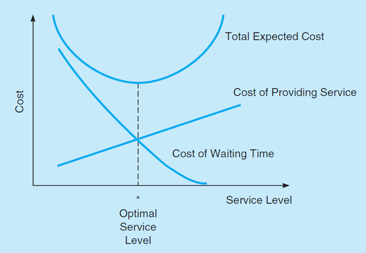
There's lots of interesting points made in Mortimer and Grimmer's article (and for more on queueing, see my 2014 blog post on the topic). However, I want to highlight this diagram:


The diagram illustrates the optimal level of service. The y-axis shows costs to the store, and the x-axis shows the service level (where a higher service level is associated with shorter queues). The store is trying to minimise their total costs, but there are two marginal costs that they are trying to balance. The first cost is the marginal cost of providing service. This is upward sloping as we move from left to right, because each additional 'unit' of service level costs the store more than the last. To see why, consider your local supermarket. If it only had one checkout, adding another checkout would be fairly low-cost - the store would give up a little shelf space (which would entail an opportunity cost of some lost sales of items that would have been displayed there), and have to pay another worker to man the second checkout. A third checkout would entail more cost, as would a fourth, and so on.

So it is easy to see why the total cost of providing service increases, but why does the marginal cost (the cost of providing one additional checkout) increase? It's because each additional checkout is not as productive as the previous one. If you only have one or two checkouts in your supermarket, the workers on those checkouts are going to be going flat out all day. But if you add a seventeenth checkout, that checkout might stand idle during quiet periods (or days, or weeks), and that added cost is going to be spread over fewer customers, so the cost per customer for that checkout (the marginal cost of that checkout) is higher than the first ones. So, that's why the marginal cost of providing service is upward sloping. It is low when providing a low level of service, but increases as you provide higher levels of service.

The second cost is the marginal cost of waiting time. This cost increases when you provide lower levels of service, because the lower service levels, the more frustrated your customers will be. Perhaps they decide to leave the store without completing their purchase, or perhaps they complete their purchase but don't return in future. Either way, that is a cost for the store (an opportunity cost of foregone sales), and the cost is greater the lower the service level. An alternative way of thinking about this is that it is the marginal benefit of providing better service.

The optimal level of service is the level of service where the marginal benefit exactly meets the marginal cost (or, in this case, where the marginal cost of providing service is equal to the marginal cost of waiting time). That's the optimal service level, because if you moved in either direction, the cost to the store would be greater.

To see why, consider a point just to the left of the optimum on the diagram above. The store is offering a slightly lower level of service than optimal. It saves on the cost of providing a checkout, but that cost saving is less than the extra waiting cost it incurs (this is easy to see on the diagram - notice that the marginal waiting cost is above the marginal cost of providing service). That makes the store worse off.

Now consider a point just to the right of the optimum on the diagram above. The store is offering a slightly higher level of service than optimal. It encourages more customers to stay and purchase, saving on waiting cost, but that is less than the amount it saves on the cost of providing better service (again, this is easy to see on the diagram - notice that the marginal cost of providing service is above the marginal waiting cost). That also makes the store worse off.

The optimal service level is probably not to ensure that no customer ever queues. It is to keep the queues just long enough that it balances the marginal cost of providing better service against the marginal cost of lost custom.

Read more:


Friday 15 June 2018

The future of education may be more blended learning, but I'm still not convinced it should be

Long-time readers of this blog will recognise that I am a skeptic when it comes to online education, massive open online courses (MOOCs), as well as blended learning (for example see here or here). Back in 2016, I argued that MOOCs were approaching that 'trough of disillusionment' section of the hype cycle. The key issue for me isn't that online learning doesn't work for some students - it is that online learning works well for self-directed and highly engaged students, while actually making less self-directed students feel isolated, leading to disengagement with learning.

So, I was really interested to read this April article in The Atlantic by Jeffrey Selingo on the future of college education:
As online learning extends its reach, though, it is starting to run into a major obstacle: There are undeniable advantages, as traditional colleges have long known, to learning in a shared physical space. Recognizing this, some online programs are gradually incorporating elements of the old-school, brick-and-mortar model—just as online retailers such as Bonobos and Warby Parker use relatively small physical outlets to spark sales on their websites and increase customer loyalty. Perhaps the future of higher education sits somewhere between the physical and the digital.
A recent move by the online-degree provider 2U exemplifies this hybrid strategy. The company partnered with WeWork, the co-working firm, to let 2U students enrolled in its programs at universities, such as Georgetown and USC, to use space at any WeWork location to take tests or meet with study groups. “Many of our students have young families,” said Chip Paucek, the CEO and co-founder of 2U. “They can’t pick up and move to a campus, yet often need the facilities of one.”...
As the economy continues to ask more and more of workers, it is unlikely that most campuses will be able to afford to expand their physical facilities to keep up with demand. At the same time, online degrees haven’t been able to gain the market share, or in some cases the legitimacy, that their proponents expected. Perhaps a blending of the physical and the digital is the way forward for both.
So, it seems that the limits of purely online learning are being reached, and (some) students are wanting something different. But reading Selingo's article, it still seems to me that it's the self-directed students that are arguing for something more than purely online learning. Again, those are the students who thrive in this model, but they are not necessarily the students that we should be focused on as teachers. And it we are trying to extend the reach of higher education to more non-traditional students, then a move to more blended learning is even more unconvincing to me. I'm still yet to see an online approach that incorporates a meaningful (and effective) way of engaging students below the median of the grade distribution, and keeping them engaged through to course completion.

Read more:


    Tuesday 12 June 2018

    Immigrant restrictions and wages for locals

    A simple economic model of demand and supply tells us that, if there are two substitute goods and the supply of one of them decreases, then demand for the other substitute will increase. This leads the price to increase for both goods. If the two 'goods' here are the labour of immigrants and the labour of locals, then a decrease in the supply of immigrant workers should lead to an increase in the demand for local workers, and higher wages for both groups. However, that simple analysis ignores that there is often another substitute for labour - mechanisation (or capital). So, it is by no means certain that restricting the number of immigrant workers will raise the wages of local workers, because employers might substitute from immigrant workers to technology, rather than from immigrant workers to local workers.

    Which brings me to this new paper (ungated earlier version here) by Michael Clemens (Center for Global Development), Ethan Lewis (Dartmouth College), and Hannah Postel (Princeton), published in the journal American Economic Review. In the paper, Clemens et al. look at the effect of the 1964 exclusion of Mexican braceros from the U.S. farm labour market. At the time, the exclusion was argued for because it would lift wages for domestic farm labourers. However, looking at data from 1948 to 1971, Clemens et al. find that it had no effect. That's no effect on wages and no effect on employment of domestic farm workers.

    They argue that the reason for the null effects is that farmers shifted to greater use of mechanisation (which they had not adopted in great numbers up to that point). They provide some empirical support for this. Crops where there was an existing technology that was not in wide use (e.g. tomatoes, where expensive harvesting machines were available that could double worker productivity) didn't suffer a drop in production after the bracero exclusion, because farmers simply adopted the available technology. In contrast, crops where there was no new technology available (e.g. asparagus) suffered a large drop in production (because farmers couldn't substitute to new technology, and fewer workers were employed).

    The lesson here is that when prompted to change, producers will usually adopt the cheapest available production technology (as I have noted before). But that isn't necessarily the production technology that policy makers want them to adopt. In this case, instead of a production technology that made use of more local workers, the farmers opted for a production technology that made greater use of mechanisation. So, even if as a policy maker you believed that reducing immigration would improve wages for local workers, it isn't certain that would be the result of polices that reduce immigration (more on the effect of immigrants on local wages in a future post).

    [HT: Eric Crampton at Offsetting Behaviour]

    Sunday 10 June 2018

    More on the Oregon marijuana market shake-out

    A few weeks ago, I wrote about the ongoing shake-out of the marijuana market in Oregon. Last week, the New Zealand Herald ran another story on this issue:
    When Oregon lawmakers created the state's legal marijuana program, they had one goal in mind above all else: to convince illicit pot growers to leave the black market.
    That meant low barriers for entering the industry that also targeted long-standing medical marijuana growers, whose product is not taxed. As a result, weed production boomed — with a bitter consequence.
    Now, marijuana prices here are in freefall, and the craft cannabis farmers who put Oregon on the map decades before broad legalization say they are in peril of losing their now-legal businesses as the market adjusts...
    The key issue there is that the profit opportunities for new growers attracted a lot of additional supply, leading to decreased profits for all. Usually, we think of barriers to market entry as being a bad thing, and indeed they are from the consumer's perspective - they decrease competition and lead to higher prices. However, from the perspective of the sellers, barriers to entry are a great thing because they provide the sellers with some amount of market power - that is, some power to raise the price above their costs.

    So, how did Oregon get into this situation? The Herald story explains:
    The oversupply can be traced largely to state lawmakers' and regulators' earliest decisions to shape the industry.
    They were acutely aware of Oregon's entrenched history of providing top-drawer pot to the black market nationwide, as well as a concentration of small farmers who had years of cultivation experience in the legal, but largely unregulated, medical pot program.
    Getting those growers into the system was critical if a legitimate industry was to flourish, said Sen. Ginny Burdick, a Portland Democrat who co-chaired a committee created to implement the voter-approved legalization measure.
    Lawmakers decided not to cap licenses; to allow businesses to apply for multiple licenses; and to implement relatively inexpensive licensing fees.
    Limiting the number of licences would create an effective barrier to entry into the market. By not limiting licences, Oregon's legislators set up a situation where marijuana sellers have to compete with many others. Note that, for now, this is only a problem for the sellers, who end up with low profits as a result of the competitive market. However, if the coming shake-out results in a smaller number of large firms being the only ones left, and Oregon goes on to crack down on the issue of new licences (which is a possibility), then we could end up in a situation where not only is there market power, but where it is concentrated in the hands of a few large sellers. Of course, that will be highly profitable for the sellers, but marijuana buyers will be much worse off.

    Read more:


    Friday 8 June 2018

    Employers offset minimum wage increases with decreases in fringe benefits

    Employment compensation is made up of the wage that employees are paid, plus other fringe benefits that employers provide. Those fringe benefits might include training opportunities, discounted (or free) goods and services, use of a vehicle, travel and accommodation, health insurance, superannuation contributions, and so on.

    If we consider a very simple model of labour demand, employers will employ any worker where the value of the marginal product of labour (essentially, the amount of profit contribution that the worker makes for the employer) is greater than the total compensation paid to that worker. If wages rise, then a bunch of workers will not be making enough profit contribution for the firm any more, and they will be laid off. This is the basis for the downward sloping demand curve for labour.

    However, employers mostly don't want to lay off workers when wages rise. So, rather than laying workers off, employers could seek to reduce the other fringe benefits they provide, keeping total compensation low even though wages have increased.

    Now consider workers on the minimum wage. Realistically, they don't receive all of the fringe benefits I listed in the first paragraph. However, they may receive discounted goods or services, training opportunities, or (in the U.S. at least) health insurance. So, is there evidence to support the assertion that employers reduce fringe benefits for low-wage workers when the minimum wage increases? There is an old literature on the effects on training, but a new NBER Working Paper (ungated version here) by Jeffrey Clemens (UC San Diego), Lisa Kahn (Yale), and Jonathan Meer (Texas A&M) looks at the impact on employer-provided health insurance.

    Clemens et al. use data from the American Community Survey over the period 2011-2016. They can't observe actual wages paid to the survey respondents, but they can look at what happens to those in different occupations. To this end, they separate occupations into those that are Very Low paying, Low paying, Moderate paying, Middle paying, and High paying. Bigger effects are expected for the Very Low paying occupations, where changes in the minimum wage are more likely to affect respondents.

    Unsurprisingly, they find that increases in the minimum wage are associated with higher wages:
    We find that a $1 minimum wage increase generates significant wage increases for workers in low-to-modest paying occupations. At the 10th percentile, increases are on the order of 12% and 9% for Very Low and Low paying occupations, respectively, and even 3% for Modest paying occupations.
    However, those wage increases are offset by decreases in health insurance coverage:
    For those in Very Low and Low paying occupations, we find that a $1 minimum wage increase is associated with a 1 to 2 percentage point (2 to 4%) reduction in the probability of coverage. We also estimate a 1 percentage point (1.5%) loss in coverage for those in Modest paying occupations, suggesting a non-trivial role for spillovers. Losses in employer coverage manifest largely among employed workers, rather than through impacts of the minimum wage on employment. 
    It's not all bad news though, because the lost value of employer contributions doesn't fully offset the increase in wages:
    When we compare wage changes to changes in employer coverage, we find that coverage declines offset a modest 9% of wage gains for Very Low wage occupations and a larger fraction for the Low and Modest groups (16% and 57%, respectively). The offsets we estimate are, unsurprisingly, much larger for the latter groups that experienced relatively small wage gains following minimum wage hikes.
    However, because they can't observe whether employers reduce the extent of insurance coverage (such as by choosing plans for their employees that have higher co-pays), the extent of offset could be worse than these results suggest.

    Finally, in the simple discussion of the minimum wage that we engage in during ECONS101 and ECONS102, we tend to suggest that at least those workers who receive a higher minimum wage and keep their job (that is, they aren't made unemployed by the decrease in quantity of labour demanded) are made better off. That might not be true. Say that employers are able to buy health insurance at a discount to the general public (perhaps because of risk pooling across their workforce, or quantity discounts, or kickbacks from the insurance provider). When the employer reduces spending on health insurance to offset the higher minimum wage and restore the original level of total compensation for a worker, the cost to the worker of the health insurance they have lost could well be much greater than the gain in wage earnings, because it would cost them more than it costs the employer to restore the same level of health insurance coverage.

    Overall, these results need to be read alongside the literature on the employment effects of the minimum wage. They also have interesting implications for the living wage movement, although I haven't seen any living wage advocates engaging with total compensation as a concept at all, when they definitely should.

    [HT: Marginal Revolution, followed by Offsetting Behaviour]

    Read more:

    Wednesday 6 June 2018

    Price discrimination and the Great Walks

    In today's New Zealand Herald, Brian Rudman argued against charging different prices to tourists and locals for access to New Zealand's "Great Walks":
    Last weekend, Green MP and Conservation Minister Eugenie Sage, followed through with the previous National Government's pledge to up fees to cover costs. But she managed to retain the existing subsidy for the New Zealanders who make up about 40 per cent of users. Kiwi trampers will now bludge off their overseas fellow travellers, whose hut fees will double to $140 per night on the Milford Track, $130 per night on the Kepler and Routeburn Tracks and $75 per night on the Abel Tasman Coastal Track. Kiwi trampers fees will remain unchanged at half this rate. In addition, international children under 18 will now pay the full fee, while New Zealand kids will pay nothing.
    Eugenie Sage says the free ride for Kiwi kids is "to encourage our tamariki to engage with their natural heritage." Fair enough, but why are they and their parents, doing their "engaging," at the expense of overseas visitors and their children? They certainly wouldn't get half-rates at a beach motel or bach over the same period...
    It now seems "fleece the tourist" has become the new game of the day.
    Indeed, and as I have argued before, so it should. Price discrimination in tourism (where locals pay different prices to tourists) is the norm internationally. New Zealand is out of line with global practice with our insistence that locals have to pay the same jacked-up prices that cash-cow tourists pay.

    The first problem here is that the "Great Walks" cost more to service than they attract in fees (another point I've made before, when the Great Walks were free). So, realistically the government has to increase fees to cover those costs (or else be subsidising trampers at the expense of hospitals or schools or something else - no subsidy comes 'free' of opportunity costs). There is no rule that says there has to be one price for all, and in fact it makes more sense to charge higher prices to tourists.

    Consider the difference in price elasticity of demand. Tourists have relatively inelastic demand for the Great Walks. They've come a long way to New Zealand, incurring costs of flights and so on. The cost of going on the Great Walks is small in the context of the total cost of their holiday in New Zealand. So, an increase in the price of the Great Walks is unlikely to deter many of them from paying (so, their demand is relatively price inelastic - relatively less responsive to a change in price).

    In contrast, for locals the price that DoC would charge for access to the Great Walks makes up the majority of the total cost of going on the Great Walks. So, a change in the price is much more significant in context for locals (so, their demand is relatively price elastic - relatively more responsive to a change in price).

    When you have two sub-markets, one with relatively more elastic demand and one with relatively less elastic demand, and you can separate people by sub-market, then price discrimination is an easy way to increase profits. Of course, the government isn't trying to profit from the Great Walks. It is trying to raise money to cover the costs while keeping access open to the maximum number of people. And that's exactly what price discrimination would allow. Charging a higher price to tourists raises the bulk of the money from tourists without deterring too many of them from going on the Great Walks, while simultaneously keeping the price low enough that locals would also want to go on the Great Walks.

    Of course, you could argue, as Rudman does, that tourists are losing out on the deal. Which of course is true - their consumer surplus (the difference between the maximum they would be willing to pay and what they actually pay for access to the Great Walks) does decrease. However, I can't see why it is government's role to protect the consumer surplus of people who aren't New Zealand taxpayers (except to the extent that we don't want to overly deter tourists from coming to the country at all).

    Raise the price of access to the Great Walks, and raise it even more for tourists. They can afford to pay, and would be happy to do so, having come all the way here to see the sights.

    Read more:


    Tuesday 5 June 2018

    Mark Kleiman on the economics of fentanyl

    On the Reality Based Community blog, Mark Kleiman has an excellent post on the fentanyl epidemic in the U.S. It is difficult to excerpt, as it is pretty thoroughly written. There are lots of excellent bits on the economics of fentanyl, so is well worth your time reading. It especially explains why the epidemic of fentanyl use is a recent problem, even though fentanyl has been around for over 60 years. The short version of the story can be summarised as:

    • Fentanyl in the 1980s was good from the dealer's perspective, as it was high value-to-bulk, so it could be transported cheaply, but from the buyer's perspective it was 'Russian roulette', because diluting accurately into a form that wouldn't potentially kill the user was very difficult;
    • Besides which, heroin was really cheap so users preferred it as a cheaper substitute, which kept demand for illicit fentanyl low;
    • Then in the 1990s, oxycodone (and hydrocodone) became increasingly available, and didn't require buyers to interact with dodgy dealers since they could buy the pills from "their favorite script-happy M.D. or “pill mill” pharmacy", so demand for these drugs increased;
    • The continuing fall in the price of heroin, alongside cracking down on diverted oxycodone and hydrocodone, encouraged buyers to switch to heroin as a cheaper substitute;
    • Chinese sellers entered the market for fentanyl, using the Internet and delivering via the standard mail service, and this increase in supply greatly lowered the price of fentanyl to direct buyers, and the wholesale cost of fentanyl for dealers;
    • This led to fentanyl becoming a cheaper substitute for dealers to sell; and
    • Some new innovation allowed dealers to dilute fentanyl in a way that was much less likely to kill users.
    All of which led to:
    And for a retail heroin dealer, the financial savings from buying fentanyl (or an analogue) rather than heroin, and the convenience of having the material delivered directly by parcel post rather than having to worry about maintaining an illegal “connection,” constituted an enormous temptation.
    This lends itself well to using a supply-and-demand model to show what is going on in the market for fentanyl, as per the diagram below. There are effects on both the demand side and the supply side. On the demand side, there has been an increase in demand (from D0 to D1). This isn't because of the change in price of fentanyl (since that would simply mean a movement along the demand curve). It is because there is less risk (of death) to buyers because the sellers are better able to dilute fentanyl (though I will come back to this point later in the post). On the supply side, there has been a large increase in supply (from S0 to S1), because of the reducing costs of production and distribution of fentanyl (cheaper sources of supply from China, along with more sellers). The combination of the increase in demand and greater increase in supply have led to a decrease in the price of fentanyl (from P0 to P1), and an increase in the quantity of fentanyl consumed (from Q0 to Q1).


    But if fentanyl is now safer because, as Kleiman wrote:
    Somewhere in here someone figured out a technique for diluting the stuff with enough accuracy to reduce the consumer’s risk of a fatal overdose: far from perfectly, but enough to create a thriving market. (I don’t know what that technique is, though I can think of at least one way to do the trick.)
    Then why have the number of overdoses greatly increased? It's probably because the number of uses (and number of doses) has greatly increased (as per the supply-and-demand diagram above). A larger number of doses consumed multiplied by a lower per-dose risk of overdose could easily lead to more total deaths than a smaller number of doses consumed multiplied by a high per-dose risk. Which has led to this:

    [HT: Marginal Revolution]

    Monday 4 June 2018

    Book Review: WTF?! An Economic Tour of the Weird

    I just finished reading Peter Leeson's new book, WTF?! An Economic Tour of the Weird. I thoroughly enjoyed his earlier book "The Invisible Hook: The Hidden Economics of Pirates", so I had high expectations for this one. The Invisible Hook explained a number of the interesting practices of pirates (e.g. why did they fly the skull and crossbones flag, and why did they adhere to the 'pirate code') using the tools of economics. WTF does a similar job for a broader collection of interesting practices such as medieval ordeals, wife auctions in England, the use of oracles to settle disputes, vermin trials, and trial by battle, among several others. Once Leeson describes some of these practices to you, they genuinely will make you think "WTF", so the book it aptly titled. The reasoning behind each practice is clearly explained and shown to be consistent with rational economic behaviour, or at least to be consistent with prevailing incentives.

    Leeson's own research is embedded throughout the book, as you might expect. Many of the topics covered have relevance to modern times as well, but Leeson surprisingly avoids drawing the reader's attention to this until almost the end of the book:
    Was Norman England's judicial system, which decided property disputes by having litigants hire legal representatives to fight one another physically, less sensible than contemporary England's judicial system, which decides property disputes by having litigants hire legal representatives to fight one another verbally?
    Is contemporary Liberia's criminal justice system, which sometime uses evidence based on a  defendant's reaction to imbibing a magical potion, less sensible than contemporary California's criminal justice system, which sometimes uses evidence based on a defendant's reaction to being hooked up to a magical machine that makes squiggly lines when her pulse races?
    How about Renaissance-era ecclesiastics' tithe compliance program, which used rats and crickets to persuade citizens to pay their tithes? Any less sensible than World War II-era US Treasury Department officials' tax compliance program, which used Donald Duck to persuade citizens to pay their taxes?
    The book makes use of an interesting narrative device - it is presented as a tour through a museum of the weird. Some readers might find that approach a little distracting. I found it quirky and an interesting way to present the material. It wasn't necessary though - based on Leeson's earlier book I'm sure he could have written an equally interesting book without resorting to creating fictional tour characters to pose questions.

    Overall, the book possibly isn't going to teach you a lot of economic principles, but it will show you how economics can be used to explain some seemingly weird practices (some contemporary, many historical). If you are into the quirky or weird, or just want to see economics pop up in unusual situations, then like The Invisible Hook this book is a must-read.

    Sunday 3 June 2018

    What's in a (first) name?

    Following on from yesterday's post on middle initials, it is interesting to wonder how important names are more generally. In a 2010 paper published in the journal Economic Inquiry (ungated and much earlier version here), Saku Aura (University of Missouri) and Gregory Hess (Claremont McKenna College) looked at the effect of first names on a number of different outcomes. They used data on over 5500 people from the 1994 and 2002 waves of the U.S. General Social Survey (and as a reminder, apart from the names data, most of the data for the GSS is available for free online).

    Unlike the other studies I've been referring to this week (see here and here and here), the Aura and Hess paper wasn't about academic outcomes, but instead about broader life outcomes. It is related to earlier work on name-based discrimination (ungated here) by Marianne Bertrand and Sendhil Mullainathan. Bertrand and Mullainathan used a field experiment (they sent out CVs with African American and non-African-American names and compared the number that were invited to interviews), whereas Aura and Hess's paper is based on survey data. Aura and Hess also look at a broader range of features of names, rather than just how much more likely they are to be names of African Americans.

    Aura and Hess find that:
    ...more popular names are generally associated with better lifetime outcomes: that is, more education, occupational prestige and income, and a reduced likelihood of having a child before 25. Also, broadly speaking, names starting with vowels and ending in either an ‘‘ah’’ or ‘‘oh’’ sound are related to poorer lifetime outcomes.
    Interestingly though, when they look at male and female names separately, the effects of names are not apparent for males, only for females (and even then, only for some of the outcome variables). Some of the problem there is the reduced statistical power from splitting the sample into males and females, but I think there's a robustness issue there as well.

    Aura and Hess conclude that their research doesn't support the discrimination argument (although, it doesn't not support it either), because the features of names are also correlated with other person-specific variables such as race and age. However, I'd argue that's exactly what we would expect if discrimination did explain the results.

    Anyway, as with yesterday's post on middle initials, if we want to look at the effects of names on academic outcomes such as the number of citations or other measures of research quality, we could easily use a similar method to those in the previous papers I blogged about this week (see here and here). That might be an interesting exercise, alongside looking at the effect of middle initials.

    So, to summarise: what have we learned this week about getting research published in top journals and cited a lot? It's possibly better for research papers to have a short title, and to use data on the U.S. Maybe middle initials matter (still an open question in terms of research quality), and maybe first name could matter (it seems there is no specific research on this in an academic context, that I can find). And, thinking back to a much earlier post of mine, having a surname early in the alphabet is a good idea if you have academic career aspirations.

    Read more:


    Saturday 2 June 2018

    Middle initials and perceptions of intellectual ability

    Continuing the theme from this week, I just read this article by Wijnand van Tilburg (university of Southampton) and Eric Igou (University of Limerick), published in the European Journal of Social Psychology (ungated earlier version here). The authors use survey data drawn from seven studies undertaken with different samples (most were University of Limerick students, but other samples were online samples from the U.S. and continental Europe) to investigate whether the use of middle initials affects people's perceptions of intellectual performance. They find that:
    Authors with middle initials compared with authors with no (or less) middle initials were perceived to be better writers (Studies 1 and 5). In addition, people with names that included middle initials were expected to perform better in an intellectual — but not athletic — competition (Studies 3 and 6) and were anticipated to be more knowledgeable and to have a higher level of education (Study 7). In addition, a similar pattern of results was obtained on perceived status (Studies 2 and 4), which was identified to mediate the middle initials effects (Studies 5-7)...
    Additional support for the robustness of the middle initials effect is evident from the use of both male and female name variations and by observing the phenomenon across samples of Western Europeans as well as North Americans.
    In other words, using your middle initial(s) increases people's perceptions of your intellectual ability. However, I wouldn't read too much into it. The effect seemed to not be apparent when there was some other signal of intellectual ability - for instance, the effect of middle initials for people who were identified to research participants as 'professors' was in the opposite direction (but not statistically significant). So, using a middle initial only may actually not be valuable for authors of research papers.

    However, it is worth noting that this was purely a stated preference study. It would be interesting to follow this up by looking at actual research papers, comparing those with authors using their middle initials with those without, in terms of subsequent citations or other measures of research quality. Of special interest would be cases where the same author uses their middle initials in some papers and not in others, and cases where middle initials are required (or prohibited) by the journal's style policy, especially if that policy has changed over time. Definitely doable, using a similar method to the papers I wrote about earlier in the week (see here and here).

    In my own case, I do usually use my middle initial. However, this is for purely practical reasons. When you have a common name, it is easy to confuse readers about who you are. For instance, there was another Michael Cameron at the Ministry of Health at the time I started writing on public health issues, and I'm sure there are many others (although interestingly, I'm the only one with a Google Scholar profile, there are at least 13 Michael Camerons with profiles on Research Gate). Hence, I am "Michael P. Cameron" in almost all of my authorship credits.

    [HT: Marginal Revolution]